
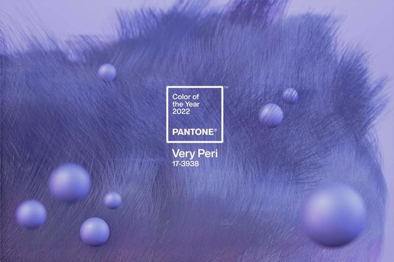
A few days ago, the Pantone Color Institute officially announced the main color for 2022. Accordingly, in 2022 the main color code will be PANTONE® 17-3938 Very Peri. Foreign newspapers claim that this is the blue color of shallow coconut flowers that create dynamism and brilliance. At the same time, this color code also inspires a creative explosive future. Erasing the dark colors of 2021 , the second year the world has to struggle with the epidemic. This is the first time in Pantone’s 22-year history that instead of choosing the available color they have created a new color code.
Look back at the colors of 2021.
Earlier in 2020, pantone chose two colors for 2021. The difficulty caused by the epidemic of 2020 is believed to be the main reason for that to happen. With the message “light at the end of the tunnel” Ultimate Grey and Illuminating were chosen. With Ultimate Grey, it signifies calmness, stability, and recovery, while Illuminating colors represent playfulness.
“They are warm, but not hot. Refreshing, not brash” – this message seems to have described the direction and choice in 2021. Factors such as: pleasant, easy to see, harmony (think harmony, not dissonance) will be the leading criteria in 2021. After a year of upheaval, the world seems to value humanity and natural elements.
The desire for a stable and restorative 2021 has not yet been realized.
More about the 2021 color trends here!
Color Recognition 2022 – PANTONE® 17-3938 Very Peri
Instead of choosing the code that’s available among thousands of colors, Pantone opts to create an entirely new color. What took Pantone nearly a year of research towards new colors? They have to do it because “It’s very important to make a new color. The design of a new color code in Pantone’s history reflects rapid change across the globe,” said Leatrice Eiseman, director of the Pantone Color Institute.
Color code PANTONE® 17-3938 Very Peri – is described as the perfect combination of periwinkle blue and red violet. Blue brings feelings of optimism, relaxation and peace as well as calling up the hi round for the great future. And the reddies bring boiling enthusiasm, the desire to reach the heights. Very Peri 17-3938 is the warmest blue of all. Make the human body touch the warmth, peace, cheerful optimism and full of acupressure. Representing the very desire of global residents for a 2022 return to “new normal” after two years of translation.
Not only that, the combination of periwinkle blue on red violet, evokes a sense of neon glow. The sub-sea for the development of the digital world and the possibility of creativity towards the future.
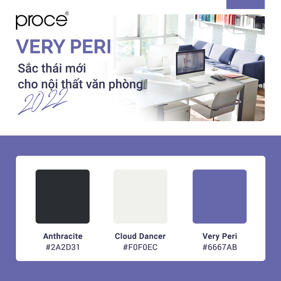
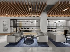
New Shades for Office Interiors 2022 – Color Trends Seen by PROCE
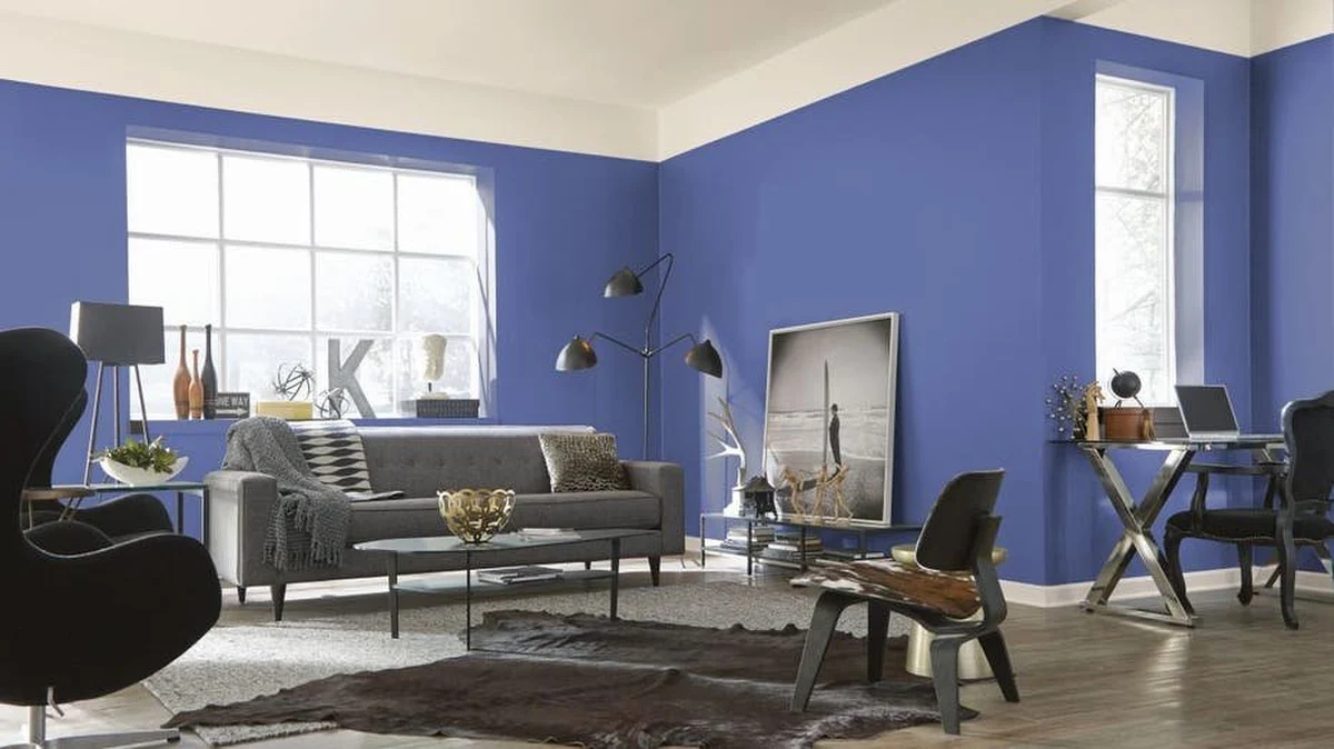
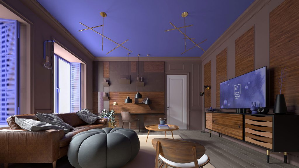
Keeping up with world trends, Proce brings in the color palette for office interior design with a Very Peri tone, a new breeze blown by Pantone with a change of mindset that expands thinking from a completely different perspective, a marker that represents the development of a new ideology in a volatile society and expectations for 2022.
As a completely new color, this color gamut will be difficult to become a popular choice when applied to office interior design. Although not yet the choice for the majority, Proce believes that Very Peri is a fairly new approach in thinking that makes a difference.
No longer a tediously available color. Very Peri blue is the warmest of all blue codes that provide gentle peace for the best performance,, while red-purple pigment also creates a dynamic and energetic working environment that creates optimistic emotions, Fun and full of enthusiasm for the staff. This is the freshness we are all looking for in life.
The choice of colors for the design not only brings aesthetic value to the office environment but also expresses the spirit and personality of the business. Building a “DNA Personalization” workspace, where the business is truly who they are, where there is a personality and cultural fit for every person to come to say “Oh! This is my second home.” Or every partner and customer who comes to that office feels that this business is the most suitable choice.”
The main color for 2022 is Very Peri – the blue color of shallow coconut flowers combines harmoniously, interestingly with the enthusiastic red color, between the “immutability” of traditional blue with the “energy and excitement” of red …
Did you know that color has a direct impact on people’s psychology and emotions?
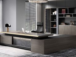
PROCE – Luxury office furniture.
YouTube: https://www.youtube.com/channel/UCmHTphVmf6cD9N9nwbb5kvA
Fanpage: https://www.facebook.com/vanphongnhapkhauProce
GG Business: https://business.google.com/dashboard/l/15115233216900975876


