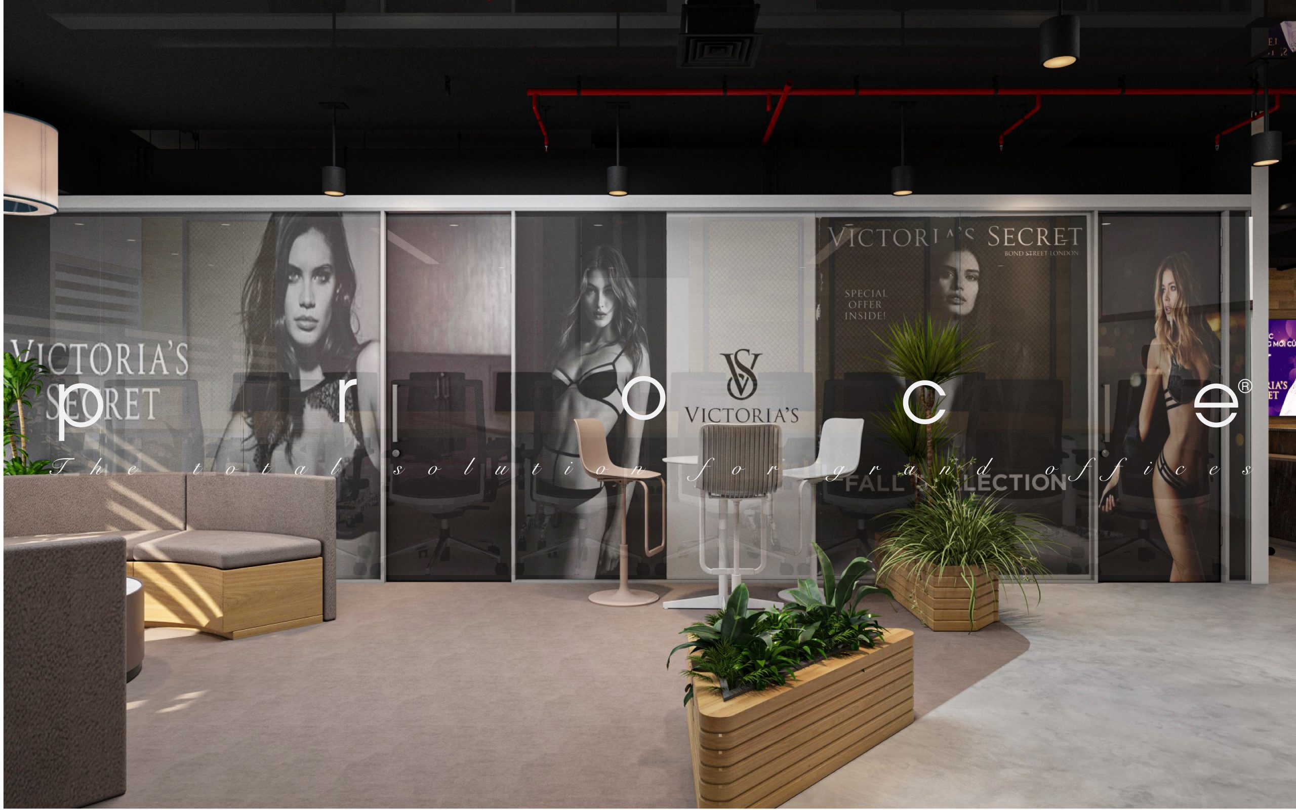
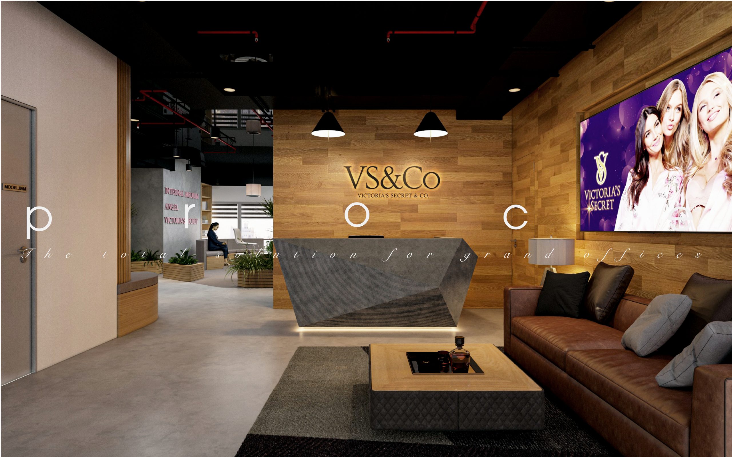
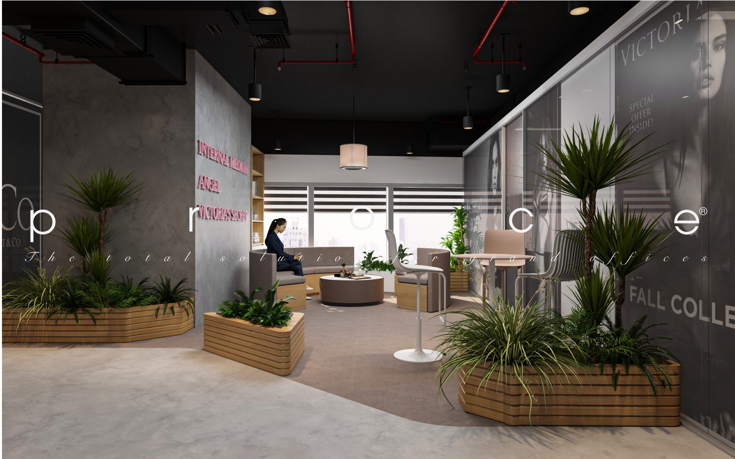
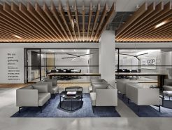
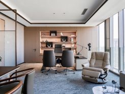
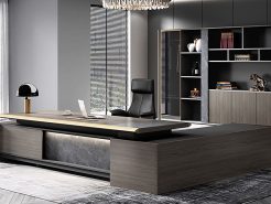
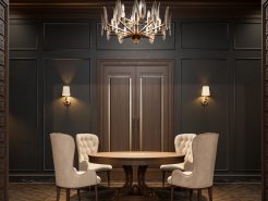
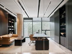
Interior design office – Designing office furniture for a fashion company is an exciting experience especially for Victoria’s. PROCE has had the honor of accompanying Victoria’s Secret in creating an office in Vietnam. It is a brand that stirs up the whole world fashion village. Victoria’s Secret has different needs for their workspace. Join PROCE to look back on the exciting experience in the design process to see their special fashion.
How did office interior design for Victoria’s Secret get started?
Victoria’s Secret came to PROCE when they started setting foot in Hanoi. Before that they had an office in Ho Chi Minh made in their own style. As a cult brand, Victoria’s Secret wants to have a great workspace. And their first choice when it comes to questioning is PROCE.
The need of Victoria’s Secret at the beginning of the implementation is to have the unity of both South and North. This is not difficult, but the floor area as well as the trend of personnel are different. After receiving Victoria’s Secret’s request, PROCE conducted an evaluation analysis. As well as clear stylistic direction for Victoria’s Secret.
2D of Victoria’s Secret Office Interior Design
The beginning was the division of functions and areas for the floor that Victoria’s Secret already owned. This is not a floor with a large area. It is also not a beautiful ground with a square area. The floor of Victoria’s Secret is a relatively difficult problem. If it is not an experienced unit or if it is not thorough, it will definitely fail. Because it has too many narrow corners that are difficult to take advantage of and especially contains many dead corners in the design.
The subdivision is carried out by PROCE based on the priority of the function and nature of the fashion industry. Areas that stimulate creativity are prioritized, followed by seating and work areas. All functions are arranged in an even para axis and in the correct order of priority from the entrance.
The most prominent as well as the first impression is the layout of the Teabreak area right near the entrance. It seems that this is unreasonable because of the privacy required of personnel. For Victoria’s Secret, however, that makes sense. Because, for the fashion industry, having space to show aesthetics and beauty is necessary. In addition, in order to optimize the already large space, PROCE has helped to systematically divide the areas. From there, it helps the space become much more coherent.
See also: process to 2D office!
What’s different about 3D for Victoria’s Secret offices
A popular fashion company, with quality aesthetics and especially strange colors. Strange compared to the color of the office, when the black and pink colors of Victoria’s Secret are really difficult to use. If used poorly, it will become ridiculous, but if it is not done, it will become bad. Even the choice of interior, material map needs to pay great attention.
Victoria’s Secret’s biggest difference lies in its requirements for color, style as well as style. It all needs meticulousness, needs a bit of modernity. It takes more than the fashion industry but requires disruption.
PROCE is a unit with absolute advantages in implementing complete construction. But in the design is also the pioneer to provide the most perfect solution. PROCE’s product was more than enough to please Victoria’s Secret.
See the full set of Victoria’s Secret offices.
=====\
PROCE – TOTAL LUXURY OFFICE SOLUTION
Website: https://proce.vn/
Youtube: https://www.youtube.com/channel/UCmHTphVmf6cD9N9nwbb5kvA
Fanpage: https://www.facebook.com/vanphongnhapkhauProce
GG Business: https://business.google.com/dashboard/l/15115233216900975876
Linkedin: https://www.linkedin.com/company/74359718/admin/
Hotline: 090.115.6767


