
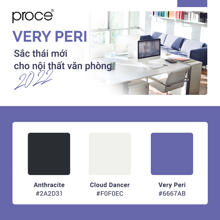
Interior design office – Designing high-end office furniture with very peri is not as easy as we think. This is a unique color tone and was created to become the trend of 2022 in every field. As we all know, Pantone created it by mixing a variety of colors. And this is a completely new color tone that has never been seen in the color palette before. It is beautiful and strange, the summation of many spirits sent in it. How can you tame this color tone and create a beautiful office space? Let’s explore that with PROCE – The overall solution for luxury office.
Interior design office – Does high-end office interior design use Very Peri tones?
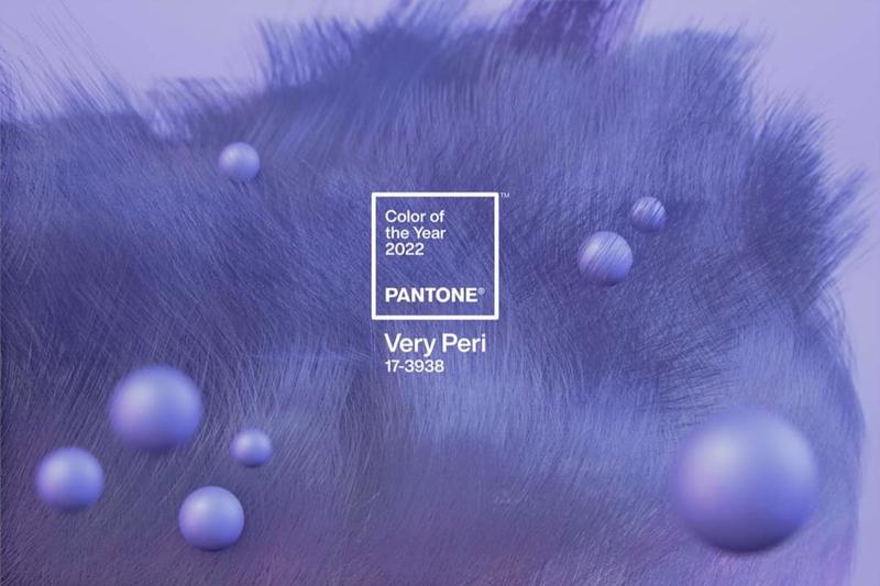
Before coming to the solution for the use of this color tone for luxury workspaces. We’ll go into the details of this color tone again. To be able to understand it and see if it is really suitable to become mainstream for the office. Especially in luxurious workspaces where pure with cold deep tones.
Very Peri is a completely new color, this color gamut is difficult to become a popular choice. It’s not a boring or monochrome color. Very Peri has the warmest blue tone that we can easily feel. It brings gentle peace that should not have been in offices before. In addition to blue, Very Peri is a blend of many other pigments including red and purple. These are the colors that bring the right acupressure heat to the workplace.
In short, Very Peri has a mission to create a new ideology, a new perspective after a series of epidemics. Bringing to the workspace a spirit, a separate personality is coded. And always aim to build an office to become the second home of hr. This ideology is unwittingly in tune with the wishes of today’s businesses. In other words, Very Peri is encoded to become the dominant color tone for the luxury workspace.
See details of this beautiful color tone here!
Interior design office – How to design high-end style interiors with Very Peri tones?
Although know that there is a harmony in the thought of this color tone with the luxury office. However, like a proudly beautiful woman, Very Peri is not easy to conquer. The personality of this color tone is so strong, it will overwhelm all other color tones. In a space, there can’t be just one color tone, especially the office. How to conquer this beautiful color?
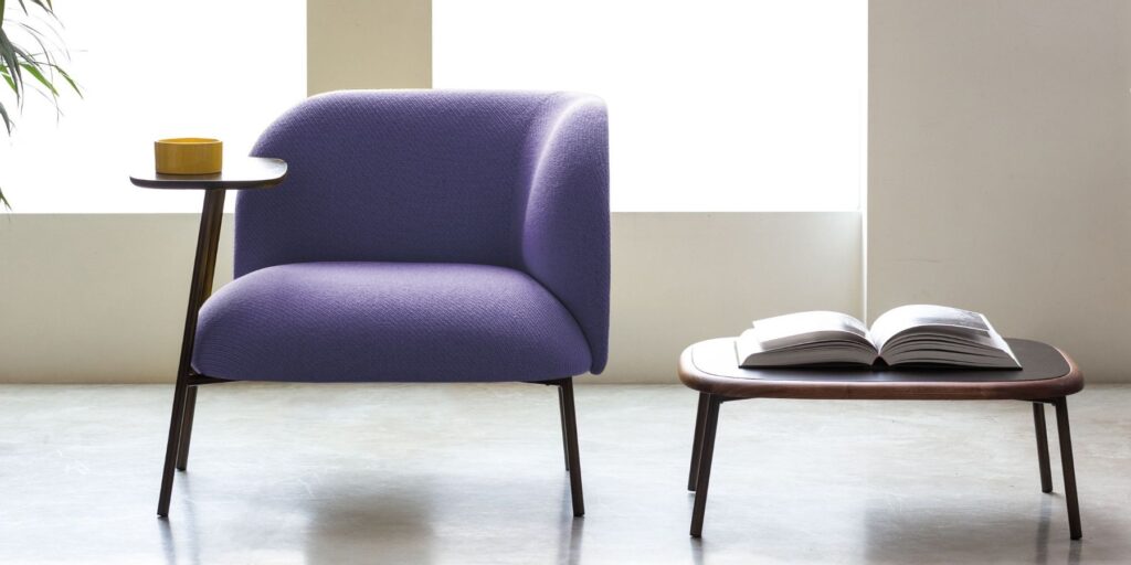
Let’s make Very Peri as the main color for the interior
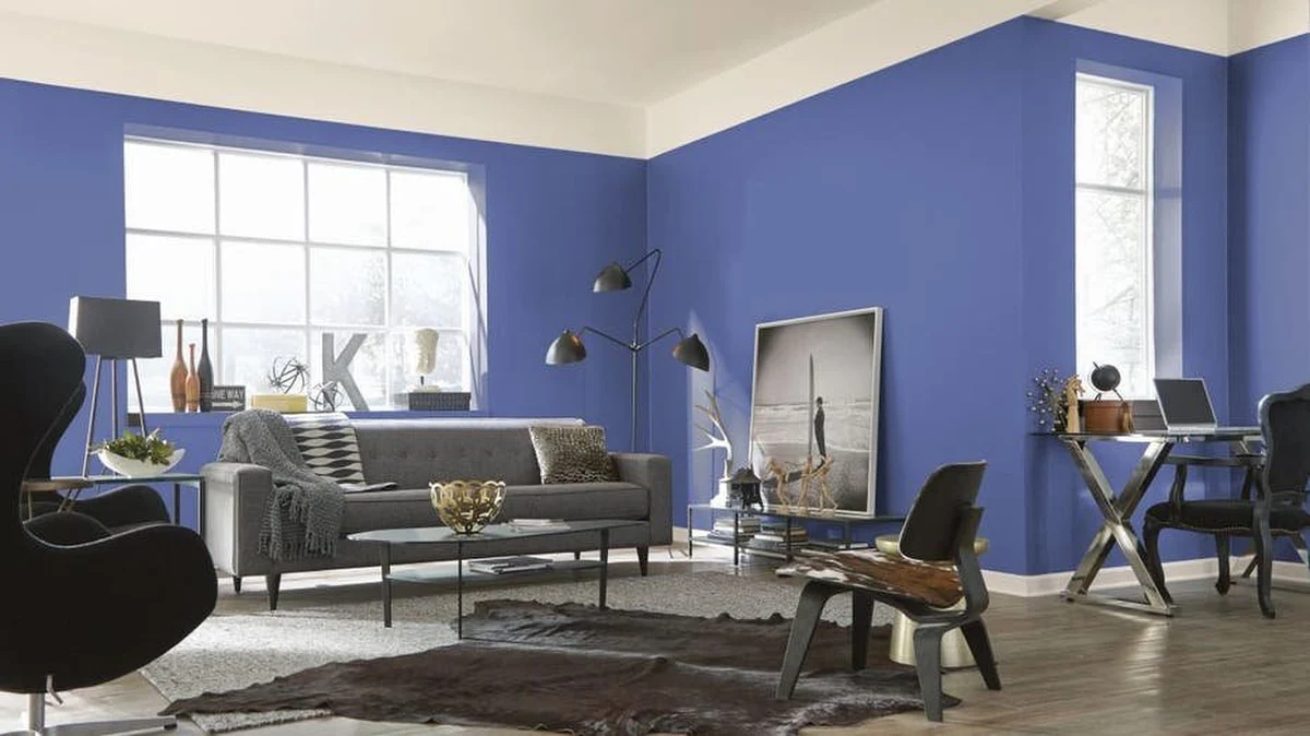
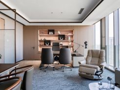
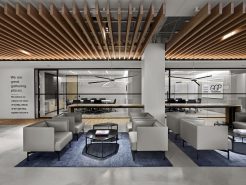
One of the solutions has been offered by PROCE’s design experts. It is to use this color tone as the dominant color for the interior, not the whole space. Understand that we need to separate the interior and the space out front to choose the color. Use Very Peri as the main color of the interior. The space is a bright or cold color depending on the area of the office.
Very Peri prefers the optical surroundings to have a cold light color. Then this color tone can stand out and capture the look without having to be too big. Use the high-end furniture products that are wearing the Very Peri shirt. Place them in a space that needs to be highlighted such as the reception, reception room. And your company has an immediate impression on your customers, partners or even employees.
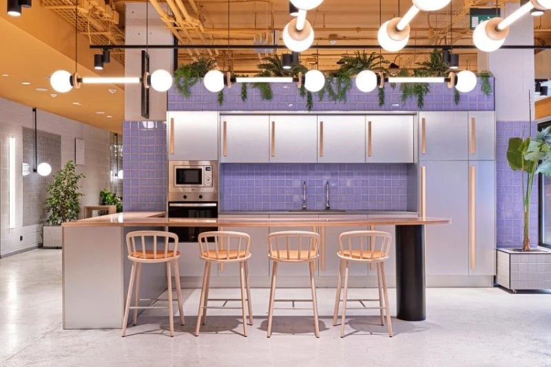
Use Very Peri as a decoration for the office
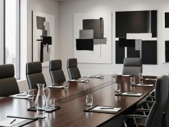
Similar to the above solution is to use Very Peri for the color of high-end office cradles. Another use is equally effective. It is the use of Very Peri in decorative walls or in small planes. Rest assured that Very Peri colors can’t be a background. Use less, but it will still be the main theme of your whole workspace.
The personality and prominence of Very Peri prevents us from using it for large spaces. Because actually in doing so it makes your office a mental suppression. Even if it only needs a small array, it is enough for Very Peri to shine sharply to attract attention. That’s why use it for the wall of the working corner. Or use as a highlight on the walls along the corridor, co-working space. PROCE encourages you to use it for the wall of the front desk to make an impression.
Note when using Very Peri color tone for office space
PROCE would like to send some notes when using the 2022 trend color for office space as follows:
– Don’t use too much in the same space.
– It is recommended to use variations of Very Peri – gentler color codes for the interior
– Use the original color to make decorative wall arrays
– It should only be used when the business wants a difference. Because Very Peri will easily overwhelm the brand color
The above is a separate opinion from proce’s design experts to be able to tame very peri color ton. Hopefully it will make it easier for you to want to use this beautiful color.
See more about how to choose colors in office design here!
=====\
PROCE – LUXURY OFFICE MASTER SOLUTION
Website: https://proce.vn/
YouTube: https://www.youtube.com/channel/UCmHTphVmf6cD9N9nwbb5kvA
Fanpage: https://www.facebook.com/vanphongnhapkhauProce
GG Business: https://business.google.com/dashboard/l/15115233216900975876
LinkedIn: https://www.linkedin.com/company/74359718/admin/
Hotline: 090.115.6767
