
Leather and wood are not only two familiar elements in interior design. They are also the “language of power” that creates a unique identity for the chairman’s meeting room. As an interior expert who has accompanied many leadership space design projects. I realize: the harmony between leather and wood colors not only determines aesthetics. But also affects the emotions, thinking and presence of the leader. So how to combine colors to make the space both luxurious and demonstrate leadership position? In this share, I will guide you on how to combine leather and wood accurately. From color coordination principles to mistakes to avoid.
1. Principles of combining leather and wood colors for the chairman’s meeting room
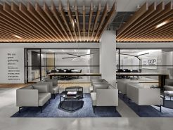
Choose the main and secondary color tones – 80/20 or 70/30 ratio to shape the atmosphere of the space
In the interior design of the meeting room, the president’s room. This is both the center of operations and the face of the business. The choice of main and secondary color tones must be based on a clear ratio principle. The most common is 80/20 or 70/30. This ratio not only helps maintain harmony, but also creates a valuable visual highlight.
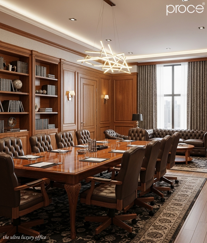
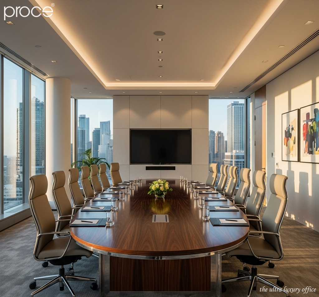
Natural wood often plays a fundamental role with warm, deep tones such as walnut or mahogany. It occupies the majority of the area (70-80%) through walls, floors, and large conference tables. Leather, with neutral tones such as chocolate brown, jet black, ivory cream, or ash gray, will be used subtly on conference chairs, armrests, or accent upholstery details, and accounts for the remaining 20-30%.
This combination helps the space maintain stability, luxury and strength. Very suitable for the image of the leader. In particular, neutral skin color has the ability to “integrate” well with many wood colors. Easy to adjust according to the season, according to natural light or according to the message that the business owner wants to convey. That is why famous interior brands always prioritize the distribution of colors according to this ratio as a formula to create class. (Chairman’s meeting room – 4 classy table models of Proce).
Basic color matching rules – Balancing emotion and function in the chairman’s meeting room
When dealing with the color combination between leather and wood in the president’s meeting room. It is not only the aesthetics that are important, but also the emotions and messages of the space. The three classic color combination rules: monochrome, light contrast and strong contrast. This is the foundation for the architect to personalize the space according to the brand orientation.
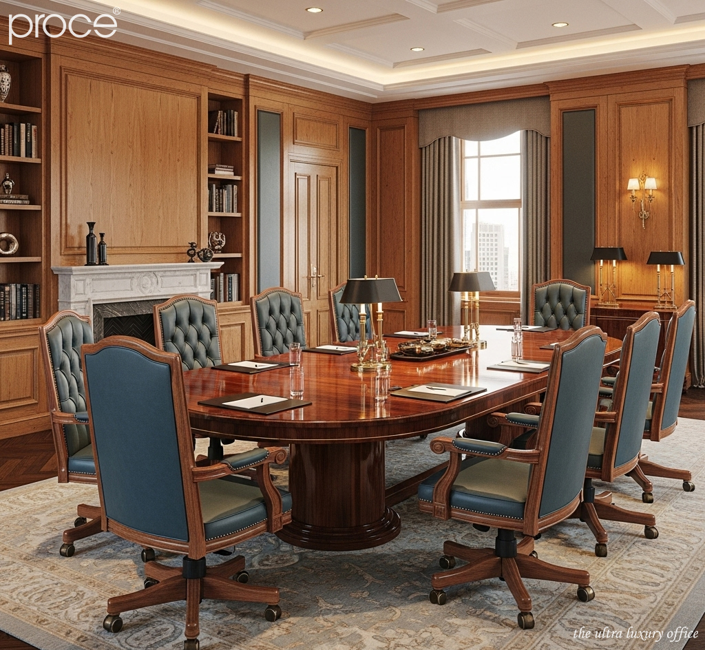
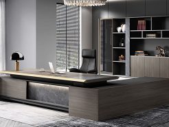
Monochromatic combination is the top choice for businesses pursuing a luxurious, calm style. Walnut wood combined with earthy brown leather creates a unified, smooth whole and shows steadfastness and maturity. The overall feeling is trust – an important factor in high-level strategic meetings.
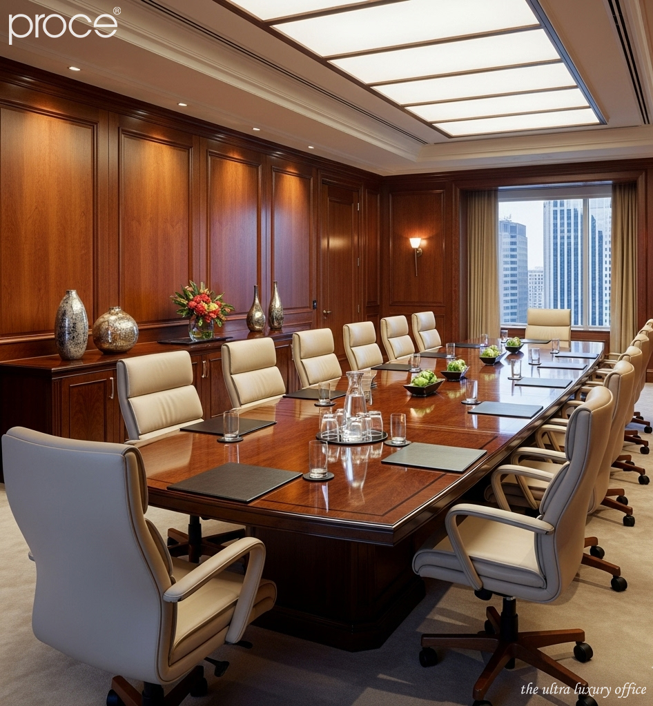
Soft contrasts, such as dark wood with light leather (beige, light gray). Brings sophistication and lightness, softening the heaviness of the wood. Suitable for meeting rooms that need visual softness, but still maintain a classy look. This is a common choice in multinational corporations, where cultural balance is a top priority.
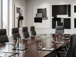
Strong contrasting combination for presidents who love difference and modernity. Light wood like white oak combined with black leather. Will bring the viewer an impressive visual effect, personality. Helps the space become prominent and distinct. This type of combination is often symbolic, expressing progressive and creative thinking.
Balancing warm and cold tones – The secret to maintaining stability and visual appeal in the chairman’s meeting room
One of the most subtle principles in conference room interior design is the balance between warm and cold colors. The president’s room space needs to exude authority, but not rigid. Intimate, but not lose its elegance. This requires a subtle and calculated color scheme. To ensure harmony in both aesthetics and space emotions.
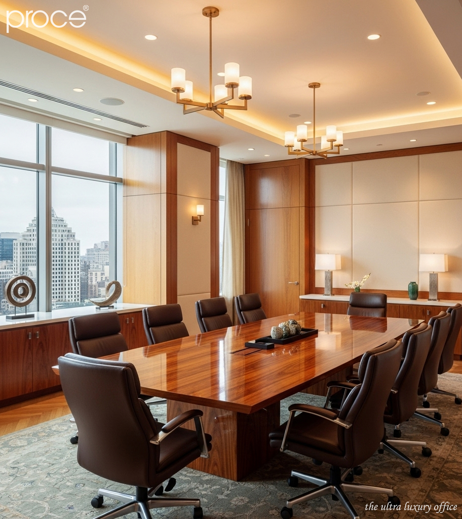
When choosing warm-toned wood materials such as walnut or mahogany. These types of wood inherently possess a characteristic deep reddish brown color. Combining them with cool-toned leather materials such as black or stone gray will create a sophisticated balance. Warm wood represents traditional values, depth and sustainability over time. While cool leather has a modern, sharp and somewhat minimalistic feel. This combination not only helps the meeting room space retain the “majesty” required of a presidential meeting room. But also refreshes it in a very contemporary way, not outdated or heavy.
On the contrary, with spaces using light-colored wood, tending towards cool tones such as white oak. The appearance of warm-colored leather such as cowhide, burgundy red or camel plays the role of “visual activation”. Helps to bring warmth and energy into the overall space. This is a direction especially suitable for young leaders who are pursuing an innovative, dynamic and creative image.
The combination of warm and cool tones is a color processing technique
This is a tool to help regulate the emotions of space. It helps dispel the feeling of monotony or dryness. At the same time, it creates an ideal meeting environment. Where concentration, alertness and work performance are always maintained at the highest level. Therefore, this is always a factor that interior architects consider especially in every design for leaders. (Do neutral colors make the chairman’s office conference room “cold”?).
Space and light – Decisive factors for color coordination to achieve maximum effectiveness
Lighting and space are two factors that can elevate or “drown” the entire color scheme. Especially in the meeting room of the president’s office. A place that not only needs to be beautiful, but also needs to maximize its symbolism and work efficiency.
If the space lacks light, for example, the meeting room is located deep, has few windows or a lot of artificial light. Absolutely avoid combining dark wood with black leather. This combination will make the space heavy, creating a feeling of claustrophobia and lack of energy. Instead, use light-colored leather such as cream, light gray, beige to reflect light and expand the vision.
On the contrary, with meeting rooms with lots of natural light, such as high-rise offices with large glass windows. The color scheme will also become much more flexible. This is the ideal condition to use strong contrasting color schemes such as light wood with black leather or dark wood with white leather. Helps the space stand out without being too dazzling or visually heavy.
Lighting also affects how colors appear
Lighting has a direct impact on the perception of color in the interior space. Under yellow light, brown leather becomes warmer and softer. While under white light, gray tones appear sharper and colder, creating a modern and streamlined feel. Therefore, choosing the right lighting system is a must in the design. It helps the leather and wood colors express the desired hue and feel.
In short, light and space are the foundation for the principles of color coordination between leather and wood to maximize their effectiveness. A successful design is not only beautiful in each material. But also in the way they interact with light to create a harmonious, classy and inspiring whole.
2. Common color matching mistakes and things to avoid when designing the chairman’s office meeting room
For spaces that require absolute standards and sophistication such as the meeting room or the president’s office. The color combination between leather and wood is not only a matter of aesthetics. It also shows the stature and aesthetic taste of the leader. However, many spaces still suffer from common color coordination errors. Significantly reducing the overall design value of the space.
One of the most common mistakes is to overuse dark tones. Especially when both leather and wood have dark tones such as dark brown, black or dark mahogany. This can easily make the space feel heavy and stuffy. Lacking the necessary openness for a strategic meeting environment. On the contrary, choosing a leather color that is too bright or out of tone with the wood color. It also creates a sense of disharmony, breaking the visual continuity.
Lack of lighting calculation is another mistake in the design process. There are beautiful color combinations on the drawing. But when put into real space, they become pale or too harsh, not creating the desired effect. Finally, the use of poor quality leather or wood, even though the color is harmonious. Will also lose the depth of the material and make the overall lack of luxury needed in a leadership space. (Contemporary monochrome painting for the president’s meeting room).
Conclude
In the design of the president’s meeting room, every detail reflects the leadership mindset and the stature of the business. The color combination between leather and wood is an indispensable part. As an interior designer, I believe that the harmony between materials and colors not only creates surface beauty. But also conveys the message of stability, class and sophistication in management style. Invest carefully in each choice of leather color, wood grain, light and layout. A standard space will help make a strong impression on partners. And also inspire and prestige for the leader himself every working day.
=====\
PROCE – TOTAL LUXURY OFFICE SOLUTION
Website: https://proce.vn/
Youtube: https://www.youtube.com/@noithatvanphonghangsang
Fanpage: https://www.facebook.com/vanphongnhapkhauProce
GG Business: https://business.google.com/dashboard/l/15115233216900975876
Linkedin: https://www.linkedin.com/company/74359718/admin/
Hotline: 090.115.6767
#phong_hop_phong_chu_tich; #Phong_hop; #phong_hop_phong_chu_tich_chuan_sang
#thiet_ke_phong_hop_phong_chu_tich; #noi_that_phong_hop_phong_chu_tich
# derco_phong_hop_phong_chu_tich; #phong_hop_phong_chu_tich_dep