Who says one color is boring? In interior design, limitations are sometimes the source of endless creativity. I have designed hundreds of workspaces. But only when applying the monochrome style, I have seen how powerful a HomeOffice can be. A single color tone, if used correctly, can turn the workspace into an aesthetic statement: minimalist, focused, uncompromising. This is not a style for those who like to play it safe. This is the choice of those who know who they are? And want their workspace to reflect that. Are you ready to reduce the color to make your workspace stand out more?
1. What is Monochrome? Why is it suitable for HomeOffice?
In modern interior design, Monochrome is not just a color choice. It is also a highly disciplined aesthetic philosophy. As the name suggests, Monochrome is a style that uses a main color tone. Then deploy it through different shades, from dark to light, from neutral to dim light. To create a harmonious and consistent whole. Many people mistakenly think that Monochrome will be monotonous or boring. But in fact, if you know how to apply it skillfully, it can create a space rich in depth, personality and sophistication.
Because of its minimalist but not boring nature, Monochrome becomes an especially ideal choice for HomeOffice space. Firstly, limiting the color palette helps to minimize visual disturbance. This is very important when you need to concentrate highly. Secondly, this style brings a sense of neatness, minimalism and professionalism. Which is what anyone who works at home wants. And finally, the way you choose the color tone, whether deep or light, clearly shows your personal aesthetic taste and professional temperament. A Monochrome-style HomeOffice is not just a workplace. It is also a space that reflects your own identity. (5 types of green plants help refresh HomeOffice space).
2. Monochrome color tones are popular for HomeOffice
White, cream, light gray tones – Minimalist, elegant and full of creative inspiration
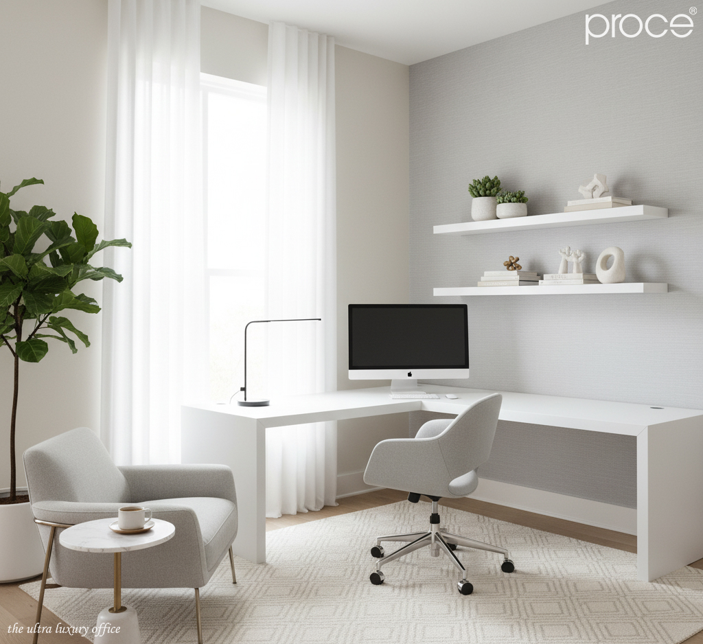
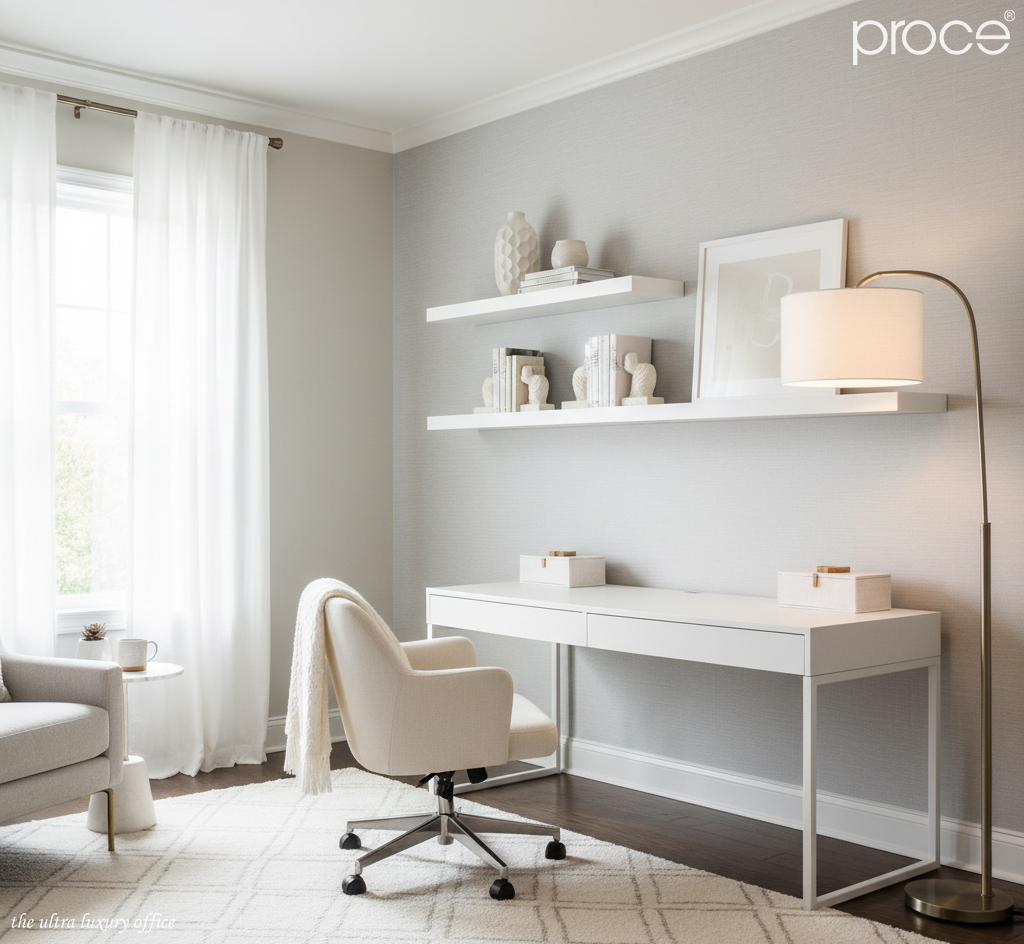
In HomeOffice interior design, white, cream, and light gray tones are a timeless choice. Especially suitable for those working in creative fields such as design, content, photography, or art. The combination of light shades of white and gray brings a strong space-expanding effect. Making the room airy, light, and full of light.
White tones are the foundation that helps reflect maximum natural light. While cream creates a feeling of warmth just enough to avoid the coldness often found in overly minimalist spaces. Light gray, acting as an intermediary, softens the glare of white and maintains a delicate balance for the whole.
When applied in the interior, you can choose a matte white desk, a cream-covered chair, combined with light gray curtains or a carpet of the same color tone. Decorative accessories such as a matte white metal table lamp, a beige-tone photo frame or a gray ceramic vase. To increase the depth without breaking the lightness of the color palette. This color tone brings an elegant, pure atmosphere but not monotonous. Ideal for those who need tranquility to nurture inspiration every day.
Black, charcoal gray, dark gray tones – Calm and powerful for leaders
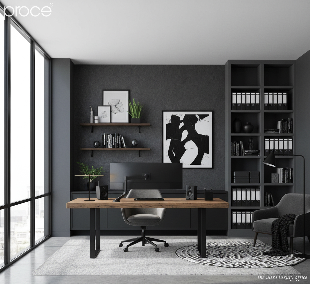
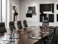
Black, charcoal gray, and dark gray tones convey sophistication, elegance, and individuality. This is the perfect color palette for people who work in management, engineering, or strategic thinking. Positions that require discipline, precision, and depth of thought.
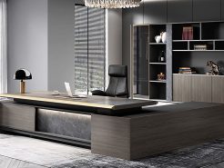
Spaces using this color tone often exude a highly professional feel. Like a miniature “control room” right at home. Black is the main color that can be present on the table top, window frame or main items such as chairs, filing cabinets. Dark gray and charcoal gray play a role in softening the black. Reducing the heaviness, while helping to balance the light in the space.
Pair a smooth charcoal gray wall with a matte black wooden desk. Add some chrome metal details or an industrial desk lamp for a modern touch. The contrast between the dark shades creates a distinct visual depth. Makes the room feel solid and focused. This color palette shows off your unique personality. It also helps to enhance your professional image, making every Zoom meeting or online presentation more impressive.
Earthy brown, beige, mocha tones – Intimate, healing and warm
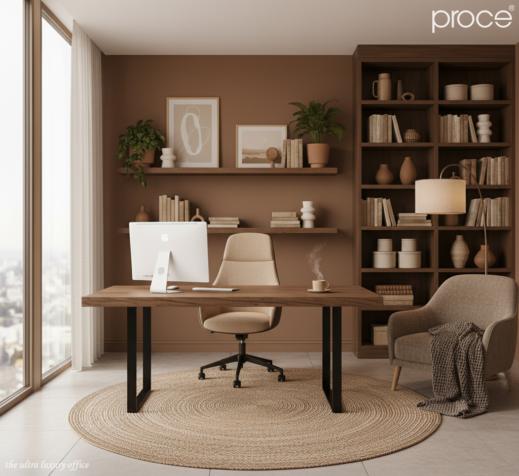
If you are a freelancer who often works long hours at home. Or simply need a “healing” space to work. Then this color tone will be the ideal companion for you. This trio creates a warm, close color combination. Simulating the feeling of nature, as if you were sitting working in a cafe with the morning sunlight.
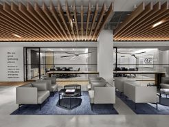
Earthy browns act as a base color that can be used for wood floors, tabletops, or accent walls. Mocha (dark coffee with milk) is a neutral color that often matches sofas, office chairs, or bookshelves. Finally, beige is a soft and soothing color that softens the overall space. It can be used for walls, curtains, or rugs.
Spaces using this color tone are not only visually pleasing, but also psychologically supportive. Warm light combined with natural materials such as raw wood, canvas, ceramics… will help reduce stress and enhance the feeling of familiarity. This is the perfect choice for those who want high work performance and need a “homey” feeling to regenerate energy every day.
Navy blue, smoky blue, pastel blue tones – Calm, deep and nurtures concentration
It is no coincidence that many modern technology offices or creative studios choose blue as the main tone. The trio of navy blue, smoky gray, and pastel blue brings a harmonious color combination of depth, balance, and a sense of peace. This is a color palette designed specifically for those who work in industries that require deep thinking such as technology, programming, design, or writing.
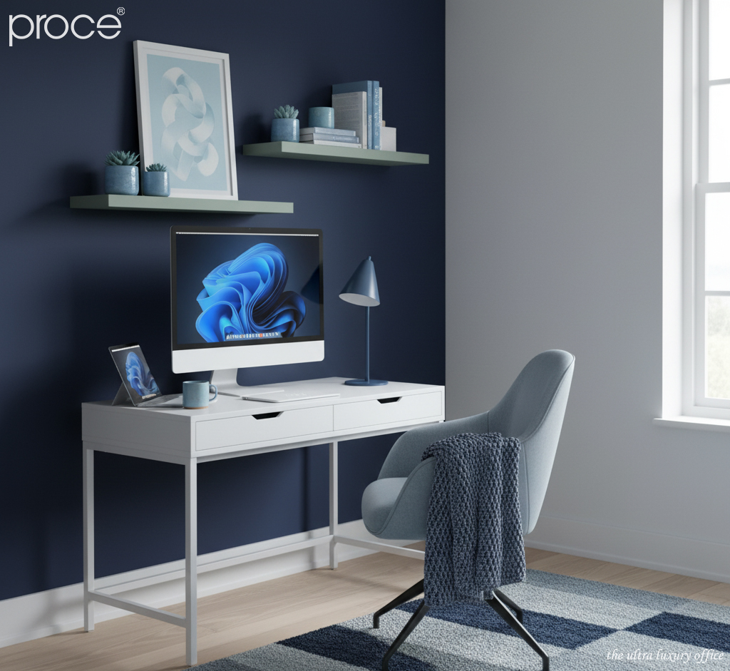
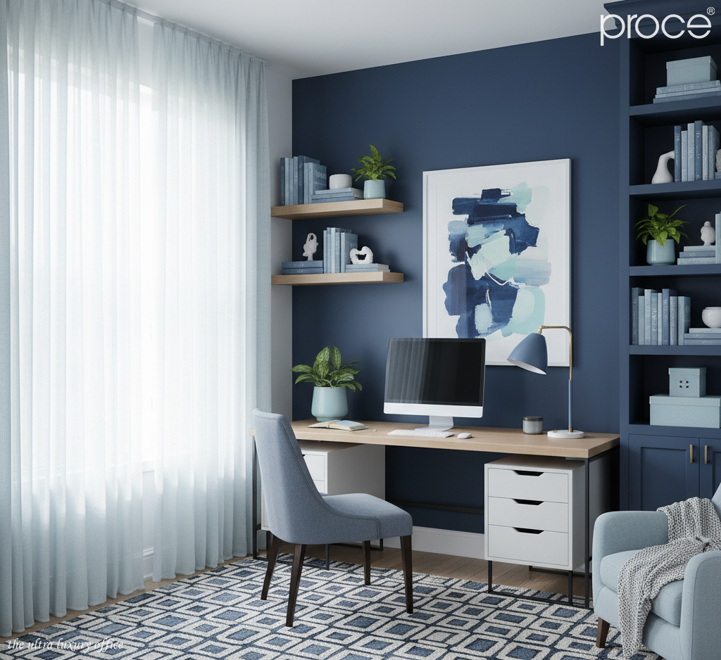
Navy blue is the main color, creating a sense of stability and seriousness but not as heavy as black. You can apply it on large walls or as a background for a desk. Smoke blue, with a more neutral tone, is a great bridge between navy and pastel. Ideal for shelves or wall frames. Meanwhile, pastel blue creates a gentle highlight, can be applied to chairs, back cushions or decorative lamps.
This blue-based color scheme is easy to combine with natural white light or neutral LED light. It helps increase concentration, maintain long-term working energy without causing eye strain. This tone is also very flexible, can be modern if using metal materials. Or have a classic feel if combined with matte painted wood. Regardless of the style, this is still an option that brings a great balance between performance and emotion. (Top 5 most unique HomeOffice design trends 2025).
3. HomeOffice design principles with Monochrome style
When designing a home office space in Monochrome style. The first and most important thing is to choose the right main color tone. That color not only suits your aesthetic taste, but also reflects your personality and working needs. Creative people can lean towards light tones such as white, cream, gray. While those who need concentration and depth can choose dark tones such as navy blue or charcoal gray. To determine the right color, don’t just look at the image. Experience the color in reality, under natural light, room lighting and combine with available elements. Your emotions when standing in that space will be the clearest “test”.
With the Monochrome style, you don’t just use one color. You should vary different shades within the same color tone. For example, with blue tones, you can combine from light pastel blue, smoky blue to dark navy blue. With gray tones, you use light gray as the background, then add medium gray and dark gray for the interior. Brown tones can combine from light beige, earthy brown to dark mocha. This combination helps the space have depth and clear stratification. You can choose light-colored walls and darker-colored furniture. Then add bright details to create highlights, avoiding monotony while still being harmonious and sophisticated.
Material and light are two vital elements
Materials also play the role of “spice” in the color palette. The same tone is expressed through raw oak, matte metal, linen or PU leather. Bringing the owner completely different feelings, rich but not confusing.
Finally, lighting is the most important element in a monochrome space. White ceiling spotlights help highlight the walls and create a spacious feeling for the space. While soft yellow table lamps bring warmth, making the office more lively and comfortable. Even though it is minimalist, the space still needs small accents such as paintings of the same color tone, vases of flowers or a few handmade items.These details help the office have its own personality, without losing the harmony of the whole. (Top 8 standard Indochine interior features for HomeOffice).
Conclude
Monochrome style is not simply playing with a single color. It is the art of creating a space that tells your own story with subtle nuances and intentional selection. In the noisy and distracting world of HomeOffice, Monochrome brings tranquility, freeing your mind to focus maximally. It is a blend of minimalism and depth. Where each item not only exists, but also contributes to enhancing the working experience. If you crave a workspace that is both elegant and efficient. Let Monochrome be your breakthrough choice, shaping your style and spirit from every shade of color.
=====\
PROCE – GIẢI PHÁP TỔNG THỂ CHO VĂN PHÒNG HẠNG SANG
Website: https://proce.vn/
Youtube: https://www.youtube.com/@noithatvanphonghangsang
Fanpage: https://www.facebook.com/vanphongnhapkhauProce
GG Business: https://business.google.com/dashboard/l/15115233216900975876
Linkedin: https://www.linkedin.com/company/74359718/admin/
Hotline: 090.115.6767
#home_office; #phong_lam_viec_tai_nha; #noi_that_home_office
#thiet_ke_home_office; #thiet_ke_noi_that_home_office
#home_office_sang_tao; #derco_home_office; #home_office_dep


