
I once walked into a chairman’s meeting room, with high ceilings, Italian imported furniture… But the first thing that caught my eye was the cold, lifeless wall. As if it was forgotten in the middle of a million-dollar project. You know? Mistakes in wall design do not make a sound. But they silently erode the emotions, temperament and majesty that a leadership conference room should have. I cannot count how many times I had to “rescue” walls that were treated like subfloors. In this article, I do not share theory. I share experience, exposing the truly “headache” mistakes that many businesses are still repeating.
Common mistakes when designing walls for chairman’s meeting room
1. Using materials that are not suitable for leadership
In the design of the chairman’s office meeting room, the use of wall materials is not simply an aesthetic choice. It is also strategic in affirming the power, value and corporate culture. However, many units make basic mistakes such as using thin plaster, poor quality wallpaper. Or the paint is too bright, flashy, and lacks depth. These materials not only lack sustainability. But also lose the solemn and dignified atmosphere that a leadership space needs.
The meeting room space also becomes less luxurious. Creates a feeling of lack of investment and lack of professionalism. Directly affects the personal image of the chairman. As well as the brand value in the eyes of partners, shareholders or guests.
Proposed solution
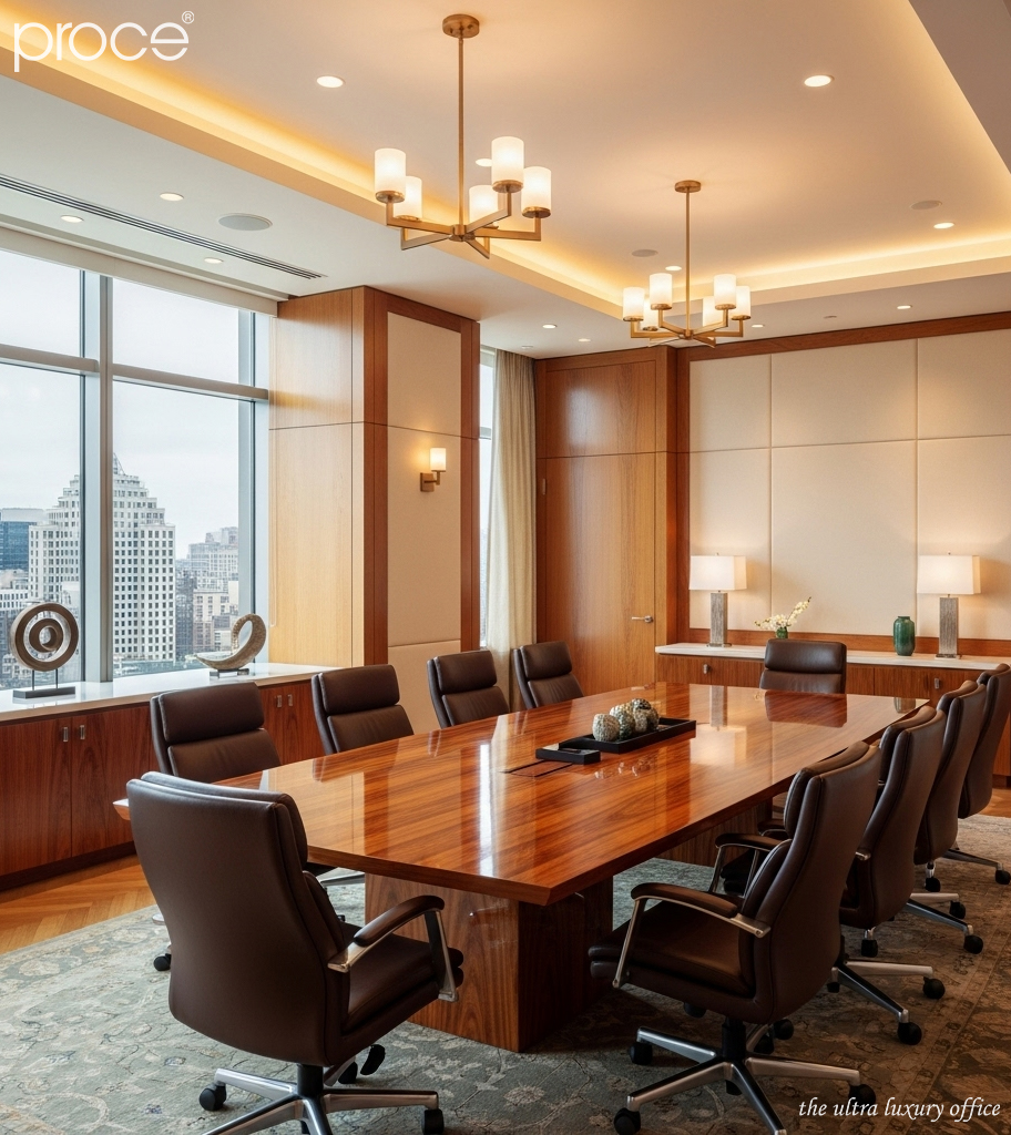
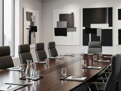
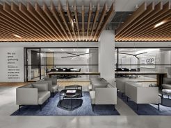
Prioritize the use of materials with emotional and aesthetic depth such as natural wood, granite, large wooden panels or Italian leather. The color palette should lean towards dark, neutral colors. For example, walnut brown, ash gray or copper black. These materials not only help to elevate the space. But also subtly convey the message of power (Harmonious combination of leather and wood colors for the president’s meeting room).
2. The wall design is not consistent with the overall interior of the chairman’s meeting room
A common but unacceptable mistake in the high-end design segment is the lack of style consistency between the wall and the rest of the interior. The wall is designed in a classic style with many details. While the furniture and lighting follow a modern minimalist trend. This will create a difference in design language. The wall cannot be a part “standing outside the story”. It needs to act as an emotional connecting axis between the floor, ceiling and furniture.
The consequence of this error is that the space becomes confusing, lacking visual logic. And makes people entering not feel the connection and interior message. Especially in the leadership meeting room, this reduces the symbolism and emotion. Making the space experience dull, even counterproductive.
The solution is to define a clear and unified overall design concept right from the beginning. You can choose one of the main styles such as modern, luxury, classic or minimalist luxury… But you still have to keep the flow throughout the overall design of the ceiling, walls, floors and interior. Walls should be treated as a part of the space. Walls need to maintain a subtle restraint. At the same time, they play the role of selective highlights. From there, you can create a seamless, harmonious space with rich visual depth.
3. Overuse of company logos and symbols on the wall
The meeting room of the chairman’s office is not a showroom or a public brand promotion area. Placing an oversized logo, repeating slogans or LED lights running on letters not only breaks the aesthetic layout. It also reduces the sophistication and class inherent in the leadership space. These ostentatious choices often come from the mindset of “the more the better”. But in the design of meeting rooms for senior leaders, it is the refinement that creates class.
Overuse of logos and spatial symbols on the walls. Also makes the space more like an internal presentation than a place for strategic decisions. This creates a feeling of “internal advertising” rather than “brand manifesto”. With international partners or VIP guests. This can lead to a false sense of brand maturity.
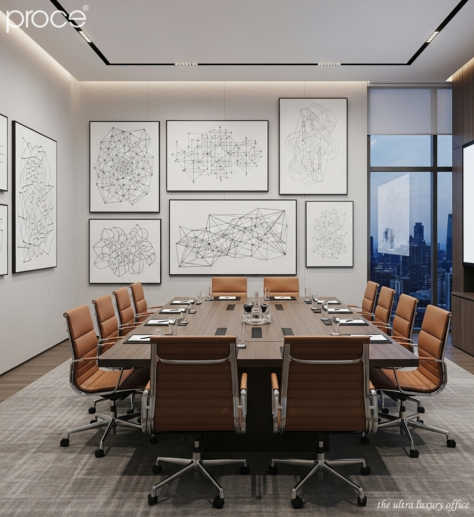
To overcome this situation, the logo should be placed delicately and with artistic depth. It can be embossed, laser engraved on wood or stone. Or hidden by clever lighting. Most importantly: the wall is not just a place to display the logo. It must also be a place to express the brand spirit through materials, lighting and overall design language. The logo is the final detail, not the center (Before and after renovation, turning traditional meeting room into Industrial).
4. Lack of artistic flair or personal identity
A high-level meeting room cannot be a nameless, emotionless place. When the walls are covered in a stereotypical neutral color. There is no artistic accent or personal mark of the leader. It easily falls into a cold and soulless state. Meanwhile, an artistic painting, a philosophical saying. Or a handmade detail associated with personal personality can activate emotions, transmit energy and create depth for the space.
A meeting room without this element will become bland. It will not leave a deep impression on the minds of attendees. Worse, it makes guests feel like they are participating in a temporary space. It does not reflect the characteristics of the leader, nor does it reflect the internal culture of the business.
The proposed solution here is to selectively insert artistic accents. It could be a modern canvas painting, a wall sculpture. Or simply a spotlight system that highlights the natural wood grain. In addition, experts recommend integrating personalized elements. Such as a life motto, a feng shui symbol that matches your destiny or a memorable image. To create a direct connection between the space and the leader.
5. Incorrect wall lighting design in the chairman’s meeting room
Lighting is the element that creates the feeling and depth of space. In the president’s meeting room – where strategic decisions are made. Wrong lighting can make the wall flat, hard and lifeless. A common mistake is to use cold white light, harsh light or worse, forget to light the wall. Making the whole space feel “frozen” emotionally.
Incorrect lighting design also makes the space lose the necessary warmth. Making the whole space dry, lacking in emotion and difficult to inspire the participants. This directly affects the psychology and work performance of both the chairman and the partners. A space without proper lighting is a “soulless” space.
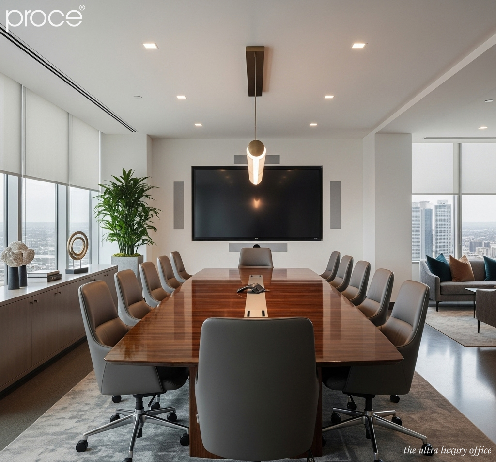
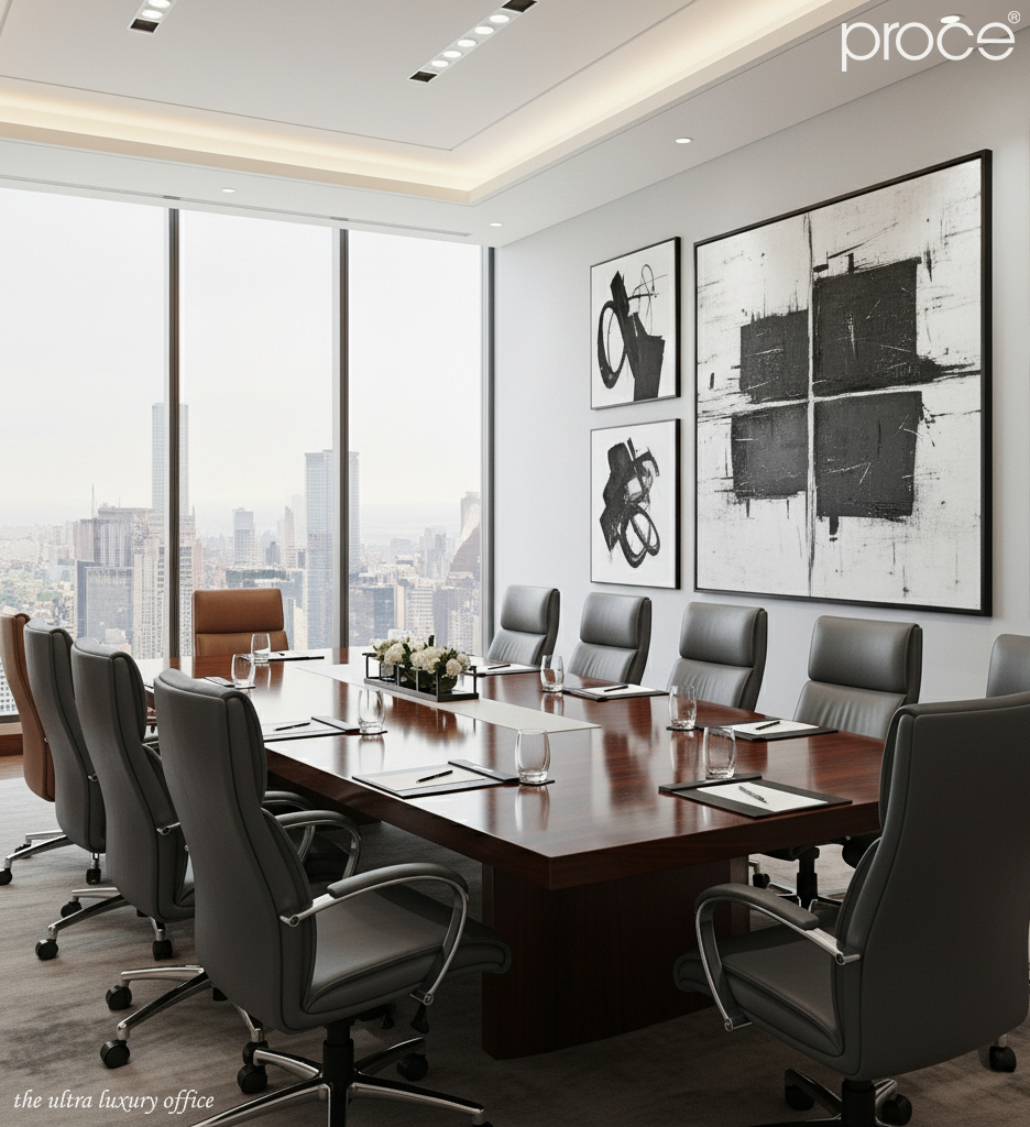
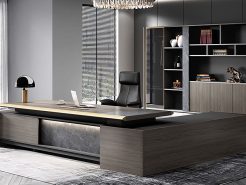
To overcome this situation, the designer needs to build a reasonable layered lighting system. In which the wall should be supported by indirect lighting or recessed spotlights to create highlights. The light should lean towards a warm yellow tone. Helps to enhance the beauty of wood grain, leather or natural stone. At the same time, it brings a sense of luxury and closeness. The core is that the light must go hand in hand with the material. Because only when the light is designed to enhance the texture, color and depth of the surface. Then the wall can truly “tell a story” (Chairman’s meeting room – 4 classy table models of Proce).
=====\
PROCE – TOTAL LUXURY OFFICE SOLUTION
Website: https://proce.vn/
Youtube: https://www.youtube.com/@noithatvanphonghangsang
Fanpage: https://www.facebook.com/vanphongnhapkhauProce
GG Business: https://business.google.com/dashboard/l/15115233216900975876
Linkedin: https://www.linkedin.com/company/74359718/admin/
Hotline: 090.115.6767
#phong_hop_phong_chu_tich; #Phong_hop; #phong_hop_phong_chu_tich_chuan_sang
#thiet_ke_phong_hop_phong_chu_tich; #noi_that_phong_hop_phong_chu_tich
# derco_phong_hop_phong_chu_tich; #phong_hop_phong_chu_tich_dep