
In luxury office design, color is not simply an aesthetic choice. It is also the art of creating a top-notch working space. Both sophisticated and inspiring. As an expert in this field, I find that unique color combinations in a modern style are the key to enhancing the value of the office. Creating a working environment that is not only beautiful, but also promotes creativity and performance. Let me explore how to combine smart colors to turn a luxury office into an ideal destination. A place where employees are always full of energy and inspiration every day.
1. Principles of color coordination in luxury office design
Use a neutral color palette as the background for a luxury office
In luxury office design, choosing a neutral color palette as the background is one of the most important principles. Colors such as gray, beige, milky white or wood brown not only bring elegance and sophistication. But also create a gentle, comfortable working space for employees. These tones also have the ability to create visual balance. Avoid causing confusion, helping workers to focus on their work.
In particular, neutral colors are also easy to combine with many different colors. Creating favorable conditions for adding vivid accents. Without losing the overall harmony of the working space. When applied, these colors are often used for walls, floors, ceilings. And large-sized furniture such as desks or shelves. Helps create a solid foundation for the entire interior design. Thanks to that, the office not only looks modern, but also brings a feeling of relaxation and comfort. Suitable for a professional working environment and requires creativity and high productivity from employees.
Highlight with bold colors
To make the office space more lively and clearly express the brand personality. Creating highlights with outstanding colors is an indispensable step. Colors such as copper gold, navy blue, wine red or jade green not only help attract the eye. But also have a distinct symbolic meaning. Contribute to affirming the luxurious and classy design style.
These colors are used subtly on small decorative items. Such as art paintings, carpets, cushions or table lamps… These are objects that help the space become closer and warmer. Color accents not only highlight the appearance of the overall space. But also create inspiration and increase creativity for staff during the working process. It is important that the combination of prominent colors must be in harmony with the neutral background. Avoid causing confusion, while conveying the message of professionalism and unique style of the business.
Color coordination according to the principle of contrast and complementarity
The principle of color coordination based on contrast and complementarity is a powerful tool to help the office become balanced and lively. The principle of contrast emphasizes the combination of light and dark tones to create depth for the space. Helps each area in the office become clear, easy to recognize while still maintaining high aesthetics.
For example, the combination of elegant light gray and outstanding bronze not only enhances the visual effect. But also creates a luxurious, modern feeling for the space. In addition, the complementary principle focuses on combining opposite colors on the color wheel. Bringing balance and natural harmony. The combination of light beige with navy blue is also a typical example of this application. Because it brings a sense of professionalism, while conveying solidity and sophistication to the working environment. When flexibly applying these two principles, the office design is not only beautiful. But also creates a feeling of comfort, stimulates creativity and improves the work efficiency of staff. (3D functionality – Key element in luxury office design).
2. The impact of color on psychology and work performance
Color and employee psychology
Color in the workspace is not only an aesthetic factor. It also has a profound effect on the psychology and emotions of employees. In the office environment, choosing the right color tone can help improve morale. Create a sense of comfort and enhance cohesion between members. Green is a typical example. It evokes associations with nature and freshness. This color helps employees relax, reduce stress and maintain psychological balance during stressful working hours.
Meanwhile, blue represents trust, intelligence and high concentration. Very suitable for workspaces that require reasoning and analysis. On the contrary, yellow brings positive energy and creative inspiration. Helps stimulate innovative thinking, suitable for group discussion or content creation areas. When harmoniously combined, these colors create a friendly, pleasant atmosphere. Help employees not only work more effectively, but also feel excited and confident in their work every day.
Color and performance
Employee performance is directly affected by the surrounding environment. In which, color plays a subtle but extremely important role. A space with a scientifically selected color palette not only creates an aesthetic impression. But also helps employees maintain concentration and a comfortable feeling throughout the working day. The combination of natural light and suitable color tones such as beige, milky white or light blue. Helps reduce eye strain, balance vision and bring a spacious, airy feeling to the office.
When the light is bright and the colors are harmonious, the morale of the staff is significantly improved. This leads to increased productivity and quality of work. In addition, maintaining a balance between warm and cold colors also helps reduce stress. Creating a friendly, professional and inspiring working environment. An office with carefully calculated colors is not only visually effective. It also contributes positively to the mental health, performance and satisfaction of the entire staff.
3. Practical application in luxury office design
Reception area in luxury office
The reception area in a luxury office is the first place to create an impression of the style and brand value of the business. The choice of beige and wood brown as the main color scheme brings a feeling of warmth, sophistication and closeness. Showing the spirit of hospitality while still maintaining the characteristic luxury.
Beige is a light background color that helps the space become open and airy. Meanwhile, wood brown creates depth and solidity for the space. Two factors that are especially important in the human environment. Where people and emotions are the center. Accents in bronze and wine red are added subtly through details. Such as door handles, picture frames or table legs. Both highlight the luxury and convey a sense of confidence and class.
In addition, the use of natural materials such as wood, bright marble and transparent glass helps the space to be both durable and reflect natural light. Bringing a modern and professional feeling. This is the area that most clearly demonstrates the spirit of “welcoming with visual experience”. Create trust and sympathy at first sight. (The timeless beauty of luxury office furniture).
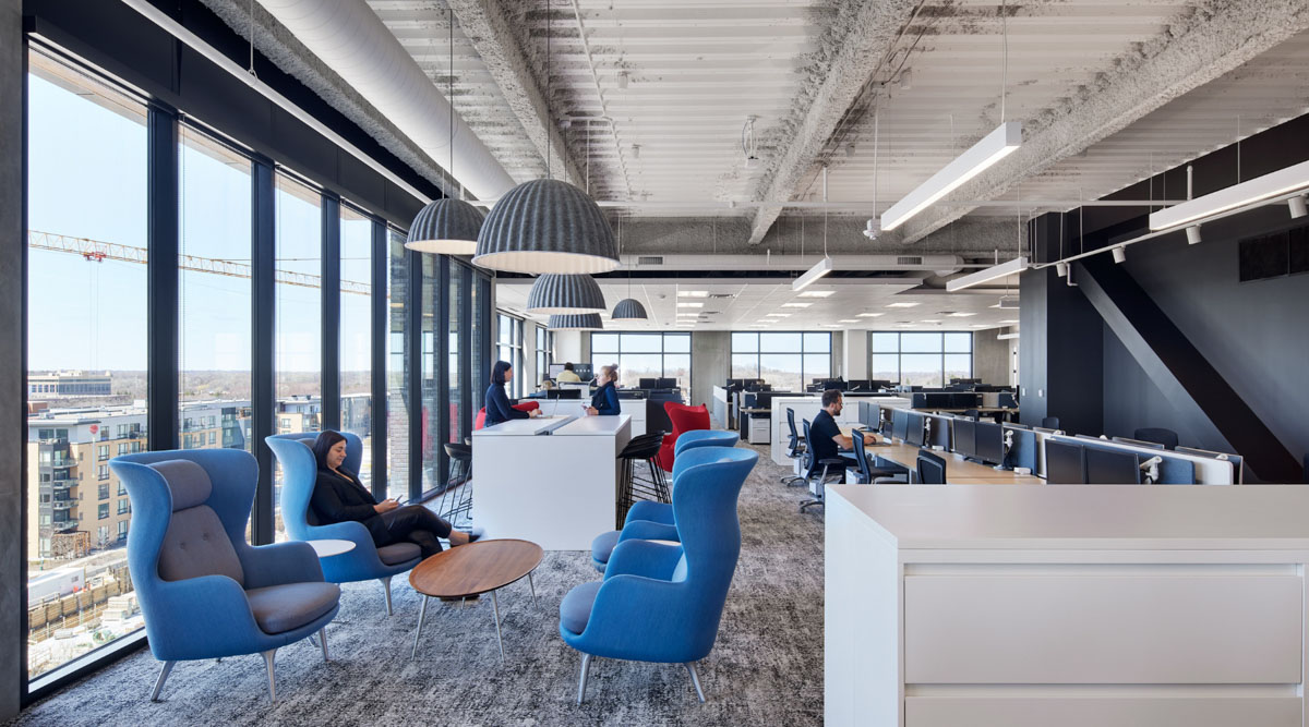
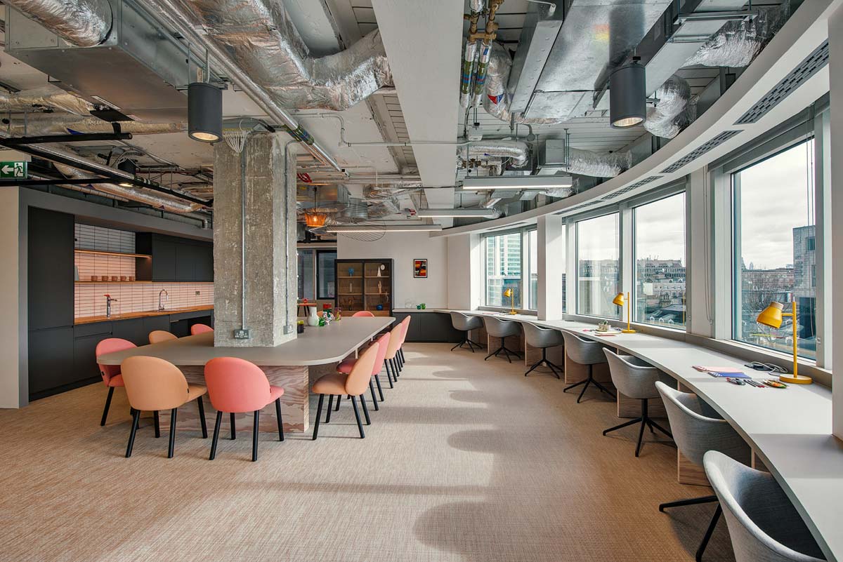
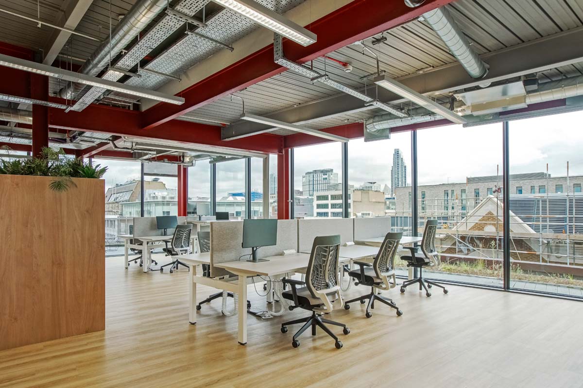
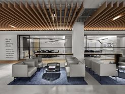
Co-working area
The common working area is the heart of the HR office. Where most of the interaction and collaboration between employees takes place. Therefore, this space needs to create a comfortable feeling and promote teamwork. In this space, light gray and milky white tones are chosen as the main colors. This helps the space become airy and makes it easy to maintain a sense of concentration throughout the working day.
These two colors also bring a visual effect of expansion. Help the area become airy and balanced in light. To avoid monotony, color accents such as navy blue and green are cleverly incorporated into the seats, partitions or decorative accessories. Navy blue creates a professional, solid feeling for the common working area. While green brings fresh energy and mental relaxation.
In terms of materials, the combination of durable industrial wood, shiny chrome-plated metal and soft felt not only ensures high aesthetics but also brings a modern and dynamic feeling. The overall space is both sophisticated and effective. Helps employees always feel excited and easily connected in an open working environment.
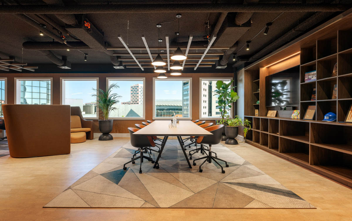
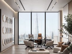
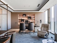
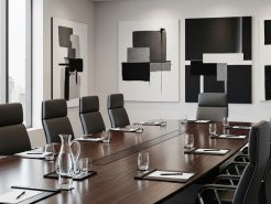
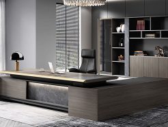
Private areas (director’s room, meeting room)
Private areas such as the director’s office or meeting room are places to show class, leadership thinking and corporate culture. Here, dark gray and wood brown are used as the main colors, bringing a sense of power, stability and professionalism. Dark gray creates depth for the space, evoking concentration and seriousness. Very suitable for strategic meetings or important decisions.
Meanwhile, the brown wood color brings warmth and closeness. Helps balance emotions, creating a sense of trust between leaders and employees. The accents of copper gold and jade green are used delicately on table lamps, cabinet borders, picture frames or decorative details… Creating a luxurious feeling, but not ostentatious. This is not only a workplace, but also an inspirational space. Demonstrating the vision of the business and the spirit of modern leadership. Where every exchange takes place in a formal but emotional and effective atmosphere.
4. Notes on color coordination in modern luxury office design
When designing a luxury office, color coordination plays an extremely important role in shaping the style, emotions and identity of the business. First of all, the factor that needs to be prioritized is the consistency with the brand identity. The main color in the workspace should reflect the spirit, values and image that the brand wants to convey. For example, technology companies can choose a modern blue tone. While high-end fashion brands often favor neutral colors and luxurious metallic tones.
In addition, flexibility is also a noteworthy factor. Choosing a color palette that can be easily changed or added helps keep the space fresh. Keep up with trends without having to renovate too much. Finally, optimizing light is an indispensable factor in high-end design. Light, bright colors such as white, beige or light gray. Not only create a spacious, sophisticated feeling. But also help reflect natural light better. Minimize the need to use artificial light. When these three factors are combined harmoniously. The office will be both luxurious and have a strong brand impression. And bring an inspiring working experience. (Luxury office – New vibe of modern youth).
=====\
PROCE – TOTAL LUXURY OFFICE SOLUTION
Website: https://proce.vn/
Youtube: https://www.youtube.com/@noithatvanphonghangsang
Fanpage: https://www.facebook.com/vanphongnhapkhauProce
GG Business: https://business.google.com/dashboard/l/15115233216900975876
Linkedin: https://www.linkedin.com/company/74359718/admin/
Hotline: 090.115.6767
#van_phong_hang_sang; #noi_that_van_phong_hang_sang
#thiet_ke_thi_cong_van_phong_hang_sang
#thiet_ke_noi_that_van_phong_hang_sang