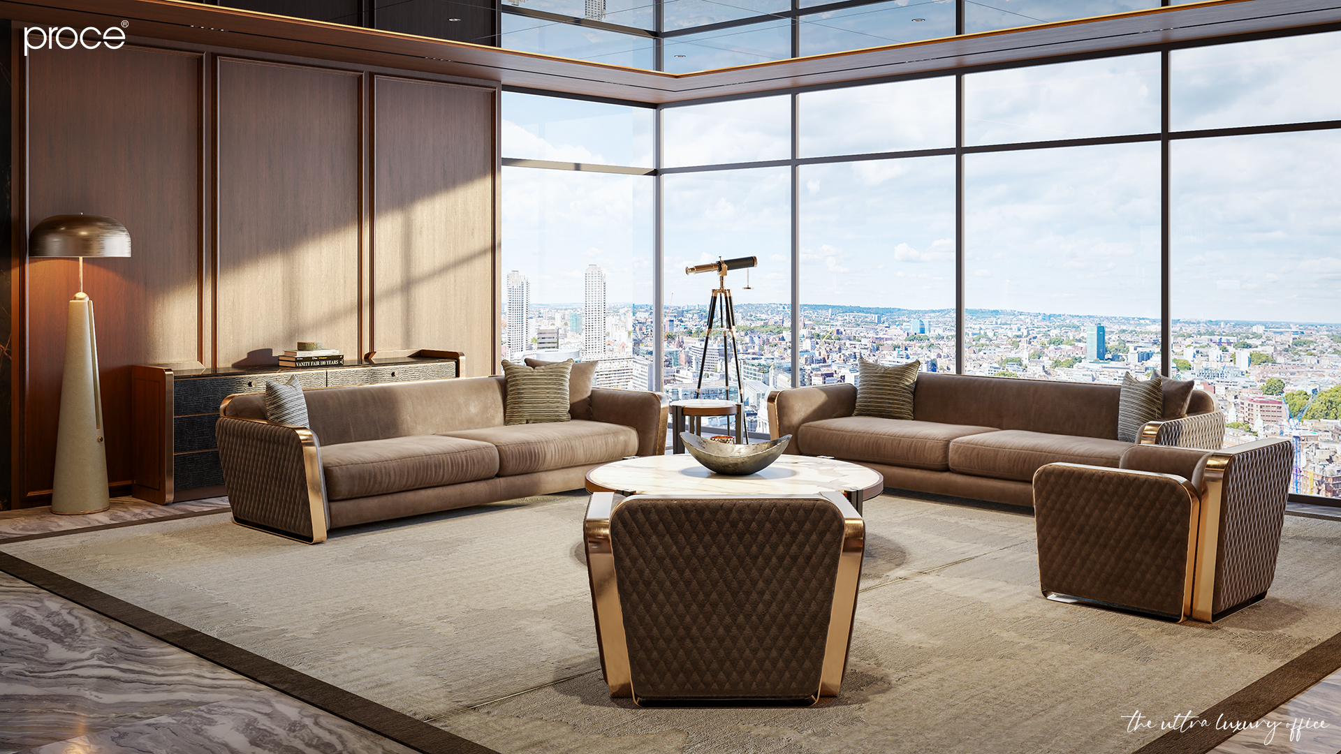
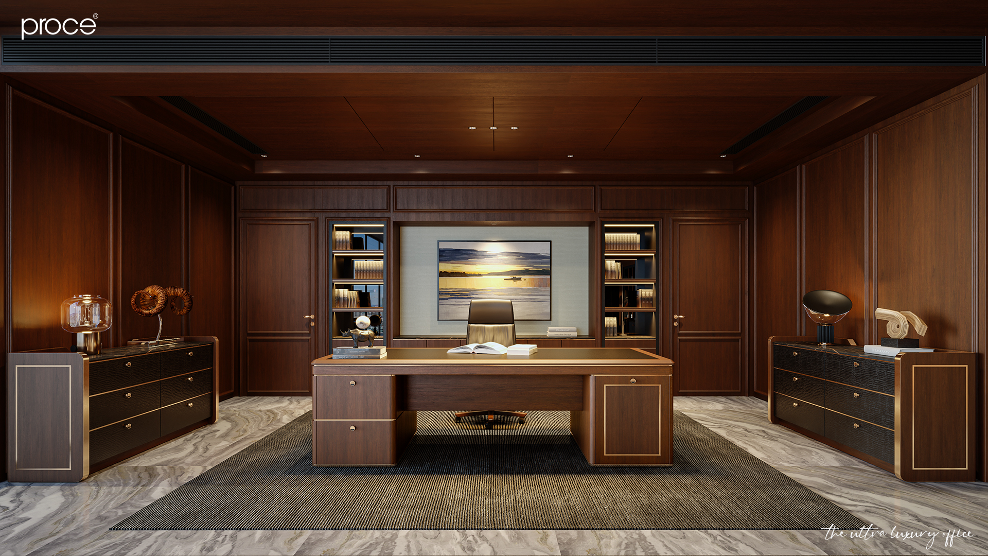
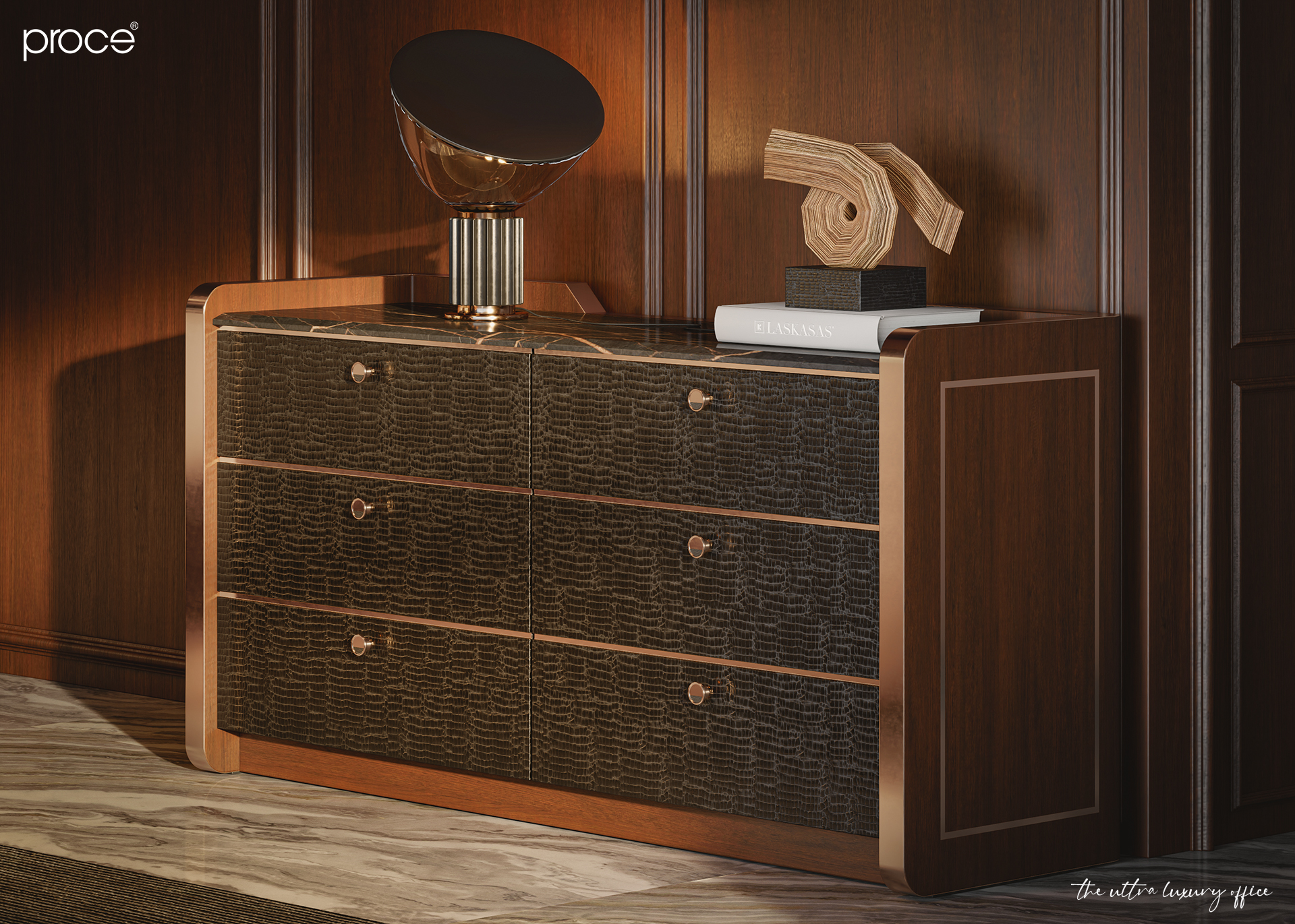
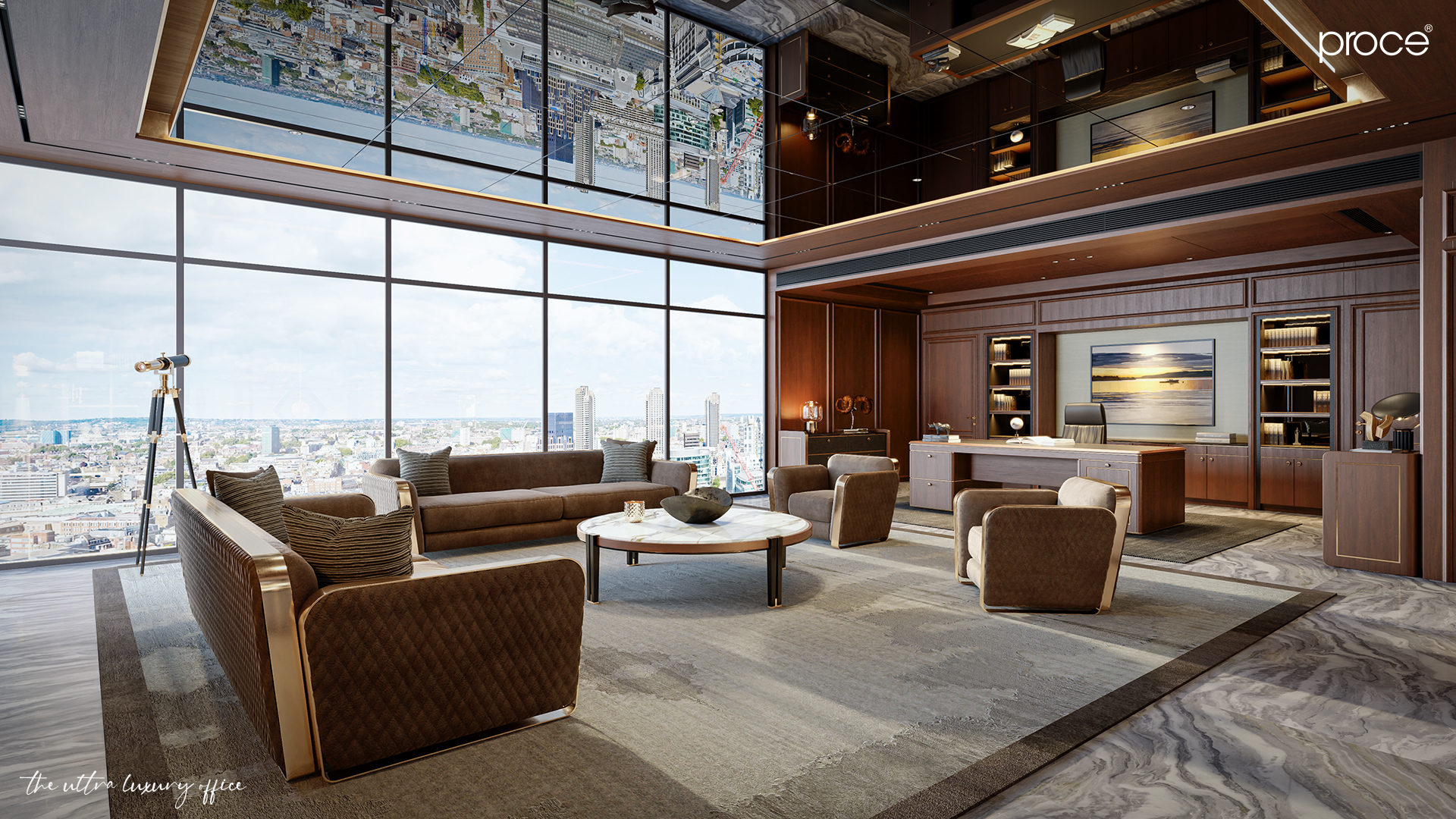
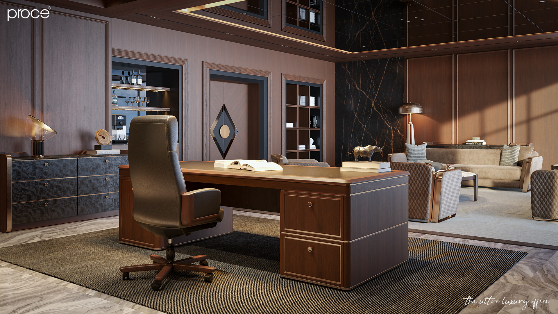
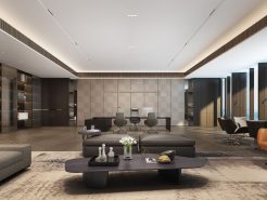
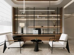
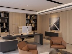
In the Chairman office design, color plays the role of fine brushstrokes that complete the artistic picture of the space. Like luxurious, majestic cloaks, colors not only beautify the room but also highlight the authority and charisma of the leader. Moreover, the right color choices can inspire creativity and enhance work efficiency, creating a working environment that is both prestigious and inspiring.
Let’s explore with the top experts at Proce the key considerations when coordinating colors in the Chairman office design in the article below!
1. Choosing the Primary Color Scheme for the Chairman office design
In the design of a President’s office, the primary color scheme plays an essential role in shaping the space. It creates a perfect blend of aesthetics and the deep, distinctive qualities of the leader’s personality. These colors not only depict style but also guide emotions, creating a formal and dignified atmosphere. The primary color scheme is the “guiding star,” highlighting the unique identity and elevating the value of this elite workspace.
For example, dark tones like navy, black, or gray bring a calm, powerful beauty. These colors are symbols of strength and professionalism, leaving a lasting impression on anyone who enters, making them feel the leader’s presence and authority from the first step. On the other hand, neutral tones like pure white, soft cream, warm beige, or light brown exude sophistication and elegance, giving the leader’s space a serene, graceful vibe. They symbolize success and unwavering confidence.
2. The Golden Rule in Color Coordination for the Chairman office design
In the color design of a President’s office, there is a golden rule that helps create a balanced and harmonious space: the 60-30-10 principle. This principle ensures a perfect fusion between the primary colors (such as ceiling, floor, and walls), accent colors (furniture colors), and focal points (such as artwork, decorative lighting, etc.).
Without a clear understanding and proper application of these principles, designers can make basic mistakes in coordinating the colors of the space.
For example, with a yellow-brown tone, a color symbolizing pride, it should be used wisely. It should both enhance the aesthetic value and create a warm, luxurious feeling in the room.
To optimize its effectiveness, the yellow-brown tone can be combined with light tones like beige for the ceiling, floor, and walls. Avoid using darker tones like deep brown or yellow, as they can make the space feel heavy and suffocating. Using lighter tones as the main color for the room not only creates an open space but also makes the office feel larger.
Furniture and accessories, which highlight the space, should also be chosen in complementary colors to enhance the overall sophistication, creating a powerful and inspiring atmosphere.
See more ways to choose colors for the Chairman Office: Here!
3. The Role of Color Contrast in the Chairman office design
Color contrast is a technique used to draw attention and add depth to the space. However, since the President’s office is where the leader works and makes crucial decisions, bright and glaring colors should be avoided as they can create a tense or overwhelming atmosphere. Instead, skillfully combining dark-light, warm-cool tones can create a balanced and harmonious workspace.
For example, in an office with a natural wood tone as the primary color, adding accents like white flowers or a brand logo sign will bring balance and harmony to the space. White not only brightens the space but also highlights the elegance and sophistication of the room’s features, making luxurious modern furniture stand out.
4. Lighting is the Key to Completing the Space
In space design, lighting is crucial in elevating the room. The colors in a space can change depending on the intensity of light at different times, making lighting particularly important, especially in a President’s office.
Natural light should be prioritized as it creates a bright, open space that attracts positive energy. Natural light benefits health and contributes to good feng shui for the leader. When combined with soft artificial lighting from various light fixtures, the space will become balanced and comfortable for the eyes, while enhancing the room’s overall beauty.
5. Materials and Colors Go Hand in Hand in the Chairman office design
Don’t just focus on choosing the primary colors for the space and overlook the subtle combination of materials. Wood, metal, stone, and leather each have unique characteristics. These materials create distinctive light effects that enrich the space.
A leather chair in deep red-brown placed on a dark wood floor is the perfect combination. It creates a workspace that is both luxurious and powerful yet full of class. This combination of the soft texture of leather and the durability and warmth of wood results in a beautiful, eye-catching look. Meanwhile, bright metallic surfaces, silver, or matte bronze bring out modern, sharp, and stylish features, adding personality to the space. The interplay between colors and materials creates a visually striking environment where every detail shines in its own way.
In Conclusion:
Color coordination in the design of a President’s office is an art of combining sophistication with functionality. Not only does it need to be visually harmonious, but this space also must provide comfort and inspire leadership. A well-thought-out investment in colors and arrangement will transform the workspace into an endless source of inspiration for its owner.
Let color tell the story of your class and vision!
=====\
PROCE – HIGH-END OFFICE SOLUTIONS
Website: https://proce.vn/
YouTube: https://www.youtube.com/channel/UCmHTphVmf6cD9N9nwbb5kvA
Fanpage: https://www.facebook.com/vanphongnhapkhauProce
GG Business: https://business.google.com/dashboard/l/15115233216900975876
LinkedIn: https://www.linkedin.com/company/74359718/admin/
Hotline: 090.115.6767
#high_class_office_funiture
#high_end_office_funiture
#Chairman_Office_design
#Chairman_Office_interior
#Chairman_Office


