
In a powerful space like the chairman’s meeting room, every design detail is a silent language expressing leadership qualities. Neutral colors with an elegant and luxurious appearance are becoming the top choice in luxury interior design. However, many people wonder if that shade makes the space cold, emotionless and distant? The answer does not lie in the color. But in the way we tell the story with those colors. This article will help you debunk common misconceptions about neutral colors in classy spaces.
Neutral Colors – The Silent Language of Subtle Beauty
Neutral colors are colors with soft tones, not too bright, dazzling and often have low saturation. This characteristic makes them soft, pleasant and easy to blend with other colors in the color palette. Not as prominent as pure warm or cool tones. Neutral colors act as a subtle background. Contribute to highlighting more important details in the overall design.
Neutral colors are divided into two main groups: cool and warm. The cool group includes shades such as white, gray, gray, and blue-gray. These are colors that bring a sense of elegance, modernity, and minimalism. In contrast, the warm color group includes tones of beige, light brown, cream, etc. These colors evoke a feeling of warmth, closeness, and a rustic, natural feel.
The highlight of neutral colors is their versatility. They can be easily combined with any color without being confusing. At the same time, they are suitable for many different styles. From luxury, classic to modern, minimalist. In interior design, neutral colors are always favored as a perfect balance solution. Bringing depth and sophistication to the overall space or layout. (Multi-color scheme for meeting room – Innovative or confusing?).
Do neutral colors make the chairman’s meeting room feel cold?
Color psychology perspective
In color psychology, the feeling of a space does not depend only on individual colors. It is also the sum of many factors. A neutral color like beige or gray. Can bring a feeling of coldness or warmth depending on how it is applied in the actual context. Lighting plays an extremely important role. Soft natural light can make gray become soft and friendly. While strong white light can easily make the same color become more rigid and distant.
In addition, surface materials also contribute to changing visual and tactile sensations. Wood, rough fabric, velvet or leather bring warmth and depth to the space. While metal, glass or stone, although bringing modernity to the space, can easily create a cold feeling.
Ultimately, the overall color scheme and the intensity of each color tone will determine the dominant emotion in the space. A room that uses too many cool colors will easily become isolated. While just adding a little yellow light and a few soft material details, neutral colors suddenly become warm and full of connection. Thus, neutral colors themselves are not fixed. They are a flexible foundation, reflecting the way the designer “tells stories” with light and materials.
Two Styles, Two Emotions – When Neutral Colors Tell Different Stories
Although both use neutral colors as the main color for the meeting room. However, the two color schemes below create two completely opposite emotional states. One side is a cold and sophisticated feeling, the other side is a warm and luxurious feeling.
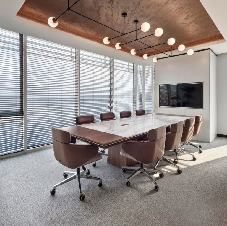
Cool neutral color group
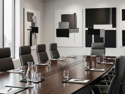
Minimalist style with cool color tones often appears in modern spaces with an industrial feel. The walls are designed in pure white, the interior is pure black. Cold white light combined with metal or stone materials. All create a neat, concise and somewhat serious whole. Although it looks very trendy and neat. However, this color scheme can easily create a feeling of distance and lack of friendliness if there are no soft accents to balance it.
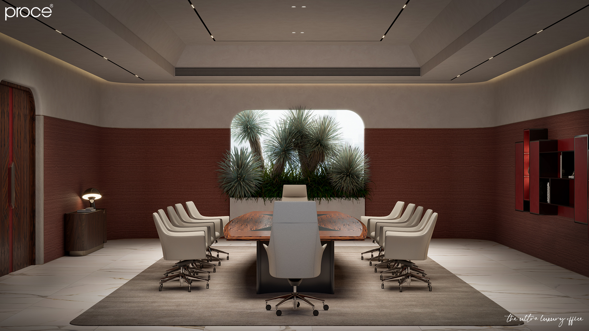
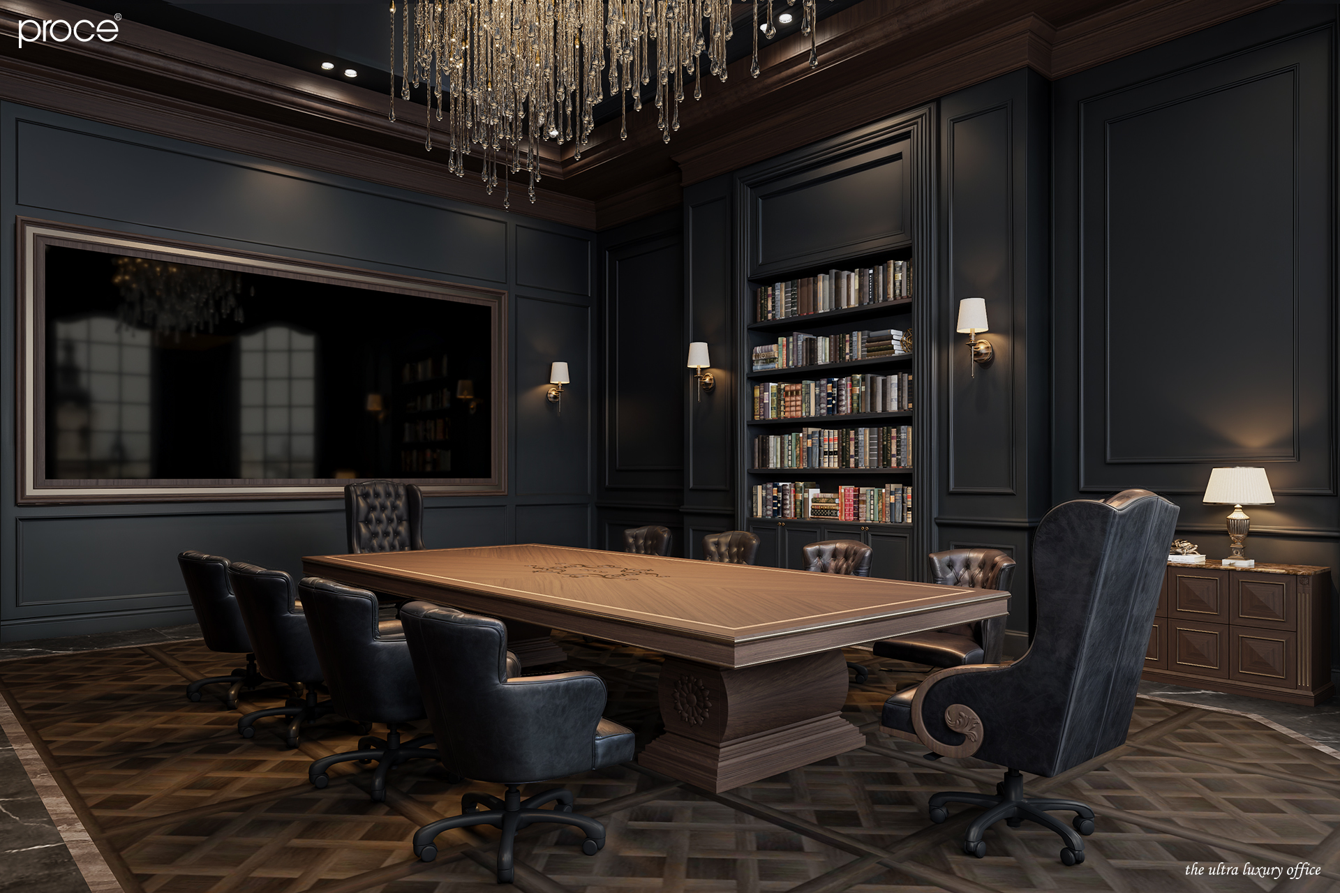
Warm neutral color group
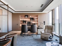
On the contrary, the use of warm neutral colors brings a sense of closeness and liveliness. Still familiar colors such as beige, brown, ivory. But when combined with soft yellow light. With soft materials such as velvet, oak, wool or art paintings. The space becomes warmer and more profound. This style is especially suitable for the chairman’s meeting room. Where the space needs to exude prestige, sophistication and connectivity. Warm neutral colors help balance solemnity and a sense of closeness. Creating an ideal environment for making decisions, inspiring and expressing the leader’s personal mark. (Brand colors for the interior design of the president’s office).
Conclude
Neutral colors are not the “culprit” that makes the meeting room space of the chairman’s office become cold. But it is the lack of depth in the use that makes the design lose its emotion. When combined properly with light, materials and space layout. Beige, gray, cream or light brown tones become symbols of dignity, luxury and intelligence. In the space for leaders. Color not only creates aesthetics. It also conveys thinking, temperament and ruling style in a subtle and confident way.
=====\
PROCE – TOTAL LUXURY OFFICE SOLUTION
Website: https://proce.vn/
Youtube: https://www.youtube.com/@noithatvanphonghangsang
Fanpage: https://www.facebook.com/vanphongnhapkhauProce
GG Business: https://business.google.com/dashboard/l/15115233216900975876
Linkedin: https://www.linkedin.com/company/74359718/admin/
Hotline: 090.115.6767
#phong_hop_phong_chu_tich; #Phong_hop; #phong_hop_phong_chu_tich_chuan_sang
#thiet_ke_phong_hop_phong_chu_tich; #noi_that_phong_hop_phong_chu_tich
# derco_phong_hop_phong_chu_tich; #phong_hop_phong_chu_tich_dep