
“A great leader cannot work in an ordinary room.” And in architecture, designing the chairman office is a big challenge. The space must reflect the temperament, thinking and stature of the leader. The secret is not in showing off, but in how to handle the depth with the material and color of the wall. A layer of matte paint can make the room quiet. Or a dark blue tone can make the space more powerful. With practical experience, I will share how the architect uses this “soft weapon”. To turn the wall into a wordless symbol of leadership.
1. Paint material – Creating surface, emotion & light in designing the chairman office
Paint materials and surface effects – Creating space with emotion and light
Choosing paint materials is not just a decision about color. It is also a way to convey emotions and regulate light in the space. In the design process, I usually start by analyzing the purpose of the room. And the intensity of natural light to choose the right paint.
For example:
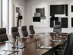
Glossy paint has the ability to reflect light very well. It creates a luxurious and modern feeling for the space. I especially recommend this type of paint in spaces with a lot of natural light. Such as the chairman’s meeting room or the reception area – where it is necessary to be prominent and visually open.
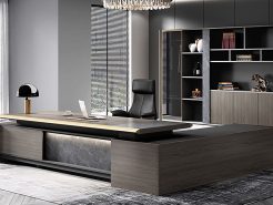
On the contrary, matte paint brings a very unique interior depth. It absorbs light, creating a feeling of solidity and calmness. Ideal for spaces that require seriousness and stability such as the president’s office. In design projects for business leaders. I also often choose dark tones combined with matte paint to create a sense of power and reliability.
In addition, effect paints such as concrete imitation paint, metallic paint or wood grain paint… are also gradually becoming a powerful tool in the hands of architects. Concrete imitation paint, with a cool gray color and a rough surface effect. Is a favorite choice for young startups or industrial style spaces. Meanwhile, metallic paint with special reflectivity. If used subtly, it can bring a sense of authority, difference, and even symbolize the personality of the leader. This is the element I often use to create highlights for spaces with strong brand positioning. (President’s Office Design – The Craftsman’s Story).
Choose paint material according to overall design style
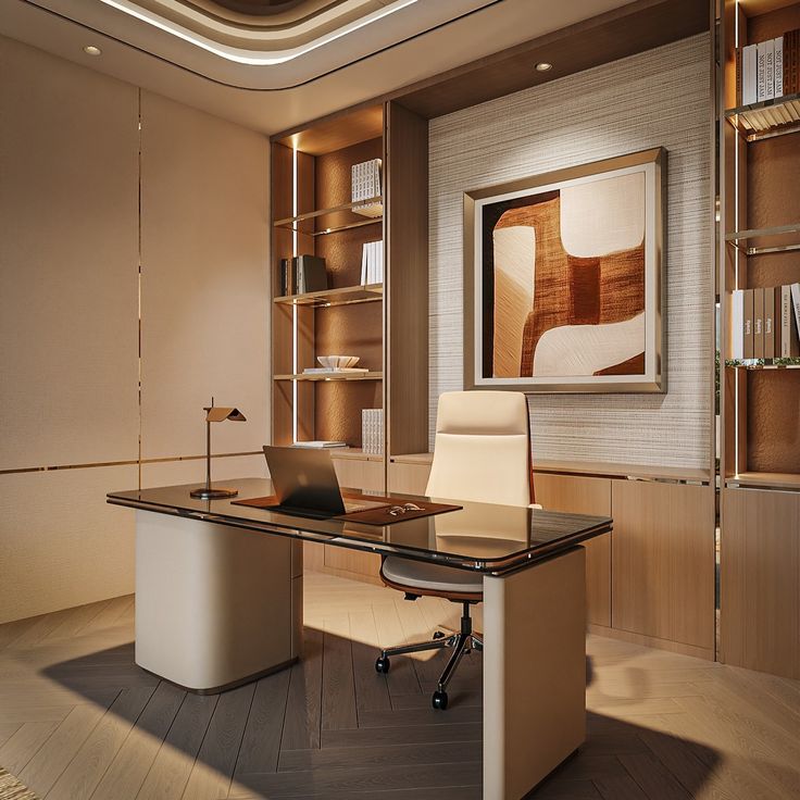
Paint cannot be separated from the overall interior style. Each architectural style requires a separate surface treatment. In order to convey the true spirit of the working space. With a classic style, I often prioritize using matte paint combined with dark colors such as ash gray, brown or dark blue. When combined with wooden strips, moldings or high ceilings. Matte paint helps create visual depth, while bringing a sense of luxury, calmness and inner strength. This is a suitable choice for traditional businesses or spaces that require trust and solemnity.
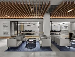
Meanwhile, modern or minimalist style requires simplicity and seamlessness in the visual experience. Pure white walls with super smooth paint, accompanied by metal accents. Such as stainless steel, copper or anodized aluminum will help enhance the neat and sophisticated spirit of the space. Cement effect paint or faux concrete is also very suitable. Because it creates a modern feel, while maintaining the natural, rustic look without being monotonous.
Particularly for the Indochinese or modern Asian style. I prefer to use paints with natural effects such as lime paint, terracotta paint or brocade paint. These materials create uneven surfaces. But it is this imperfection that brings a very unique charm, closeness, warmth and full of cultural memories. I often use manual techniques to process these layers of paint. To achieve spatial effects and surface textures in each wall section. Creating a space not only for working, but also for feeling and connecting.
2. Color – Creating psychological & visual depth
Color language in designing the chairman office – Expressing personality and personal mark
The color in a leader’s workspace is not just about aesthetics. It is also a way to express one’s character, position, and vision. In design practice, I often choose powerful, deep colors such as navy blue, dark brown, or charcoal gray. These are colors with high stability, bringing a sense of trust and inner depth. They are suitable for spaces that require solemnity and calmness such as the chairman’s office or high-level executive meeting room.
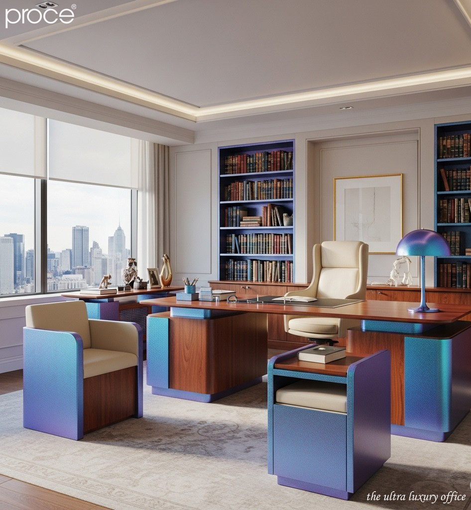
In addition, neutral tones such as beige, pearl white or mouse gray are also popular. Because of the ability to easily coordinate with interior and lighting. In particular, these tones are less likely to be outdated according to trends and maintain a long-lasting luxurious look. For businesses with clear brand positioning. I often cleverly incorporate the identity color into accent pieces. For example, a wall behind the chairman’s chair with dark navy paint combined with a metal logo. This is a subtle way for the space to “speak” the brand without words. (Laroma table and selected materials in the design of the president’s room).
Color matching techniques – Creating visual depth and spatial emotion
Color coordination is not just about choosing tones that match. It is also the art of creating visual rhythm and spatial emotion. In leadership spaces, I often use the accent wall technique to direct the gaze and increase psychological depth. A wall painted a darker color than the rest, such as behind the desk. Can act as a visual “axis of power”. Make the space more focused and deep.
In addition, the ombre or layering effect – playing with shades from light to dark in the same color palette. Also brings a “soft movement” effect on the wall surface. Brings the feeling that the space is “breathing”. This is a technique I often use in spaces that need to be quiet but still lively.
Finally, I always recommend combining paint with natural materials such as wood, stone or metal. When the light hits the real surface of the material. Depth is no longer a mere visual effect. It becomes tactile, real and alive.
Conclude
Designing the president’s office is not simply a matter of function or aesthetics. It is the art of carving a space with weight and character. In which, the painted wall is the “second skin” of the room. Where emotions, light and depth intersect. And when the wall paint is chosen correctly in terms of color, material and spirit. It not only creates a background, but also becomes a silent declaration of the leader’s stature. A declaration that needs no words, but cannot be ignored.
Learn more about the top 6 trends in president’s office design in 2025: Here!
=====\
PROCE – TOTAL LUXURY OFFICE SOLUTION
Website: https://proce.vn/
Youtube: https://www.youtube.com/@noithatvanphonghangsang
Fanpage: https://www.facebook.com/vanphongnhapkhauProce
GG Business: https://business.google.com/dashboard/l/15115233216900975876
Linkedin: https://www.linkedin.com/company/74359718/admin/
Hotline: 090.115.6767
#thiet_ke_phong_chu_tịch; thiet_ke_phong_chu_tich_chuan_sang;
#thiet_ke_noi_that_phong_chu_tich; #thiet_ke_phong_chu_tich_dang_cap
#noi_that_trong_thiet_ke_phong_chu_tich; Proce_thiet_ke_phong_chu_tich
#thiet_ke_phong_chu_tich_chat