In a business setting, when we mention the “president,” we often picture an authoritative, dignified figure — someone with the power to make important decisions and strategies for every project. However, focusing solely on the individual image of the president doesn’t fully capture the unique qualities of the leader.
The essence of the captain is not only shown through their appearance and leadership skills, but also through their style, particularly the color scheme in their office design.
In this article, Proce will help you understand how the colors in the design of the president’s office reflect the essence of the leader.
1. Colors of a Luxurious and Calm Space:
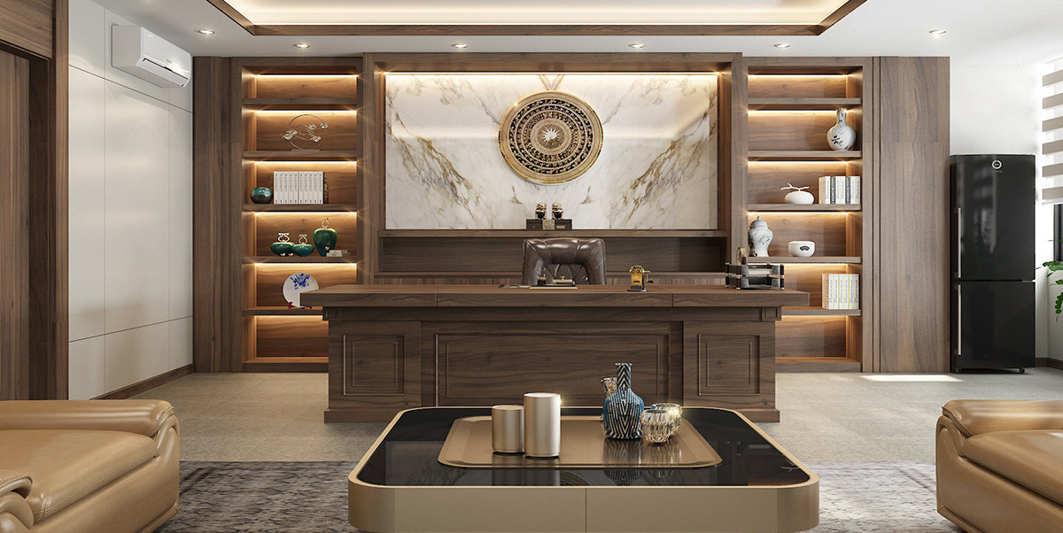
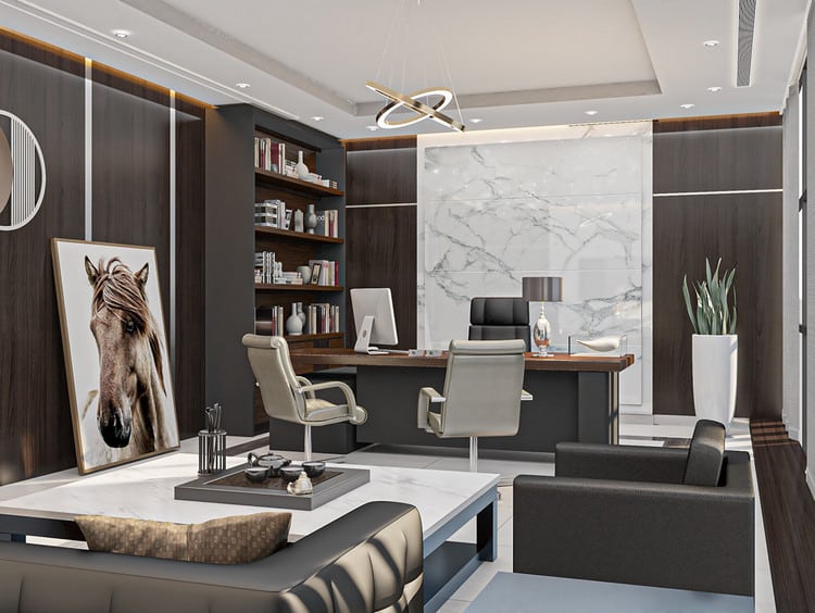
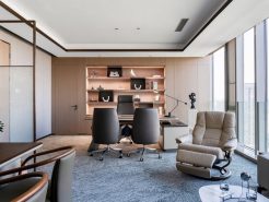
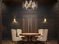
When we think of “luxury,” we often think of neutral tones. These are colors with balanced shades of light and dark, used to highlight other dominant colors. Some common shades you may see here include: black, white, gray, beige, and brown. These tones, when paired with vibrant accents, create a visually harmonious space that feels both luxurious and warm.
1.1. The Leader’s Essence Through Neutral Tones in the President’s Office Design:
The president’s office is a place few get to visit. Proce understands these limitations and, by advising on the use of neutral tones in the office design, helps evoke the image of a powerful, elegant, and distinct leader.
Anyone who steps into this space will immediately feel at ease, with a pleasant visual experience.
The Leader’s Appreciation for Refinement:
Your leader is someone who appreciates refinement, elegance, and modernity. This color scheme is one that cannot be overlooked. Colors like gray, beige, and white provide freshness and softness while maintaining a sense of luxury.
The Harmony of Neutral Tones:
Furthermore, neutral colors are easy to blend with other office interior design elements. They can complement vibrant colors to create accents or combine with other neutral tones to form a sophisticated, balanced color palette.
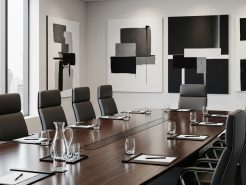
By adding decorative items or classic paintings with rich, bright colors, a distinctive touch can be added to the refined atmosphere.
Colors of Flexibility:
“Peace” and “warmth” are easily felt in this space. Neutral tones are versatile and suit every style, from classic to modern. Whether the leader prefers the nostalgia of the past or the elegance of contemporary design, these neutral hues create a tranquil atmosphere.
1.2. The Colors of Love and Affection in the President’s Office Design:
Why are these colors referred to as the colors of love and affection? Entering a space filled with neutral tones is entering a realm of luxury and sophistication. These colors embody the essence of power, with “nobility” traditionally reserved for royalty.
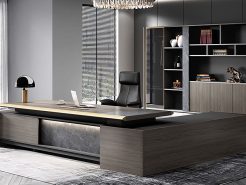
When paired with white, gray, or brown furniture, neutral tones create a soothing, intimate, and cozy environment for the president’s office. These colors evoke a gentle beauty that is never too showy.
One of the standout features of neutral tones is their timeless durability. Regardless of changing trends or evolving times, neutral tones remain a unique, refined, and luxurious color palette — just like the character of the captain.
2. The President’s Office – A Soft Landscape Like the Sky with Cool Colors:
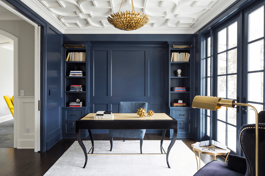
While the essence of luxury and refinement is portrayed through neutral tones, those who prefer gentleness and softness — like the clouds in the sky — would find the cool color palette perfect for their office design. These colors bring to mind vast skies or serene, dreamlike lakes. Cool tones such as sky blue, mint green, and light purple create a refined and calming atmosphere for the president’s office.
2.1. Colors That Complete the Beauty of Interior Design:
Cool tones are one of the hottest trends this year. These colors have a gentle, calming effect that can help clear the mind and relieve stress. Like a soothing remedy for the soul, cool colors create a feeling of freshness and space.
Dressing the space in these gentle hues makes the more luxurious wooden furniture and the shimmering golden metal accents stand out, creating a harmonious and appealing overall design.
2.2. A Healing Remedy for the Soul:
Studies show that cool tones have a significant impact on human emotions. They help relax muscles, reduce body temperature, lower blood pressure, and foster a sense of happiness and comfort.
In interior design, cool colors not only help create a fresh and modern atmosphere but also maintain tranquility. The space feels like a fairytale, with imagery of lush grass, flowers, and a calm lake, reflecting the clear blue sky. Anyone who enters such an atmosphere will feel mentally rejuvenated.
2.3. The Modern Leader’s Essence:
The cool color scheme is ideal for a leader with a modern, youthful spirit, yet still grounded in inner peace. These tones contribute to a refreshed environment, making the office both artistic and contemporary in every detail.
3. The Color of a Sweet Sunset:
Just like food, colors in interior design influence people’s emotions and moods. While cool tones are like a soft, poetic painting, warm colors in interior design resemble a sweet sunset. This is an artistic beauty that conveys a passionate and energetic spirit.
3.1. The Color of Ripe Tangerines:
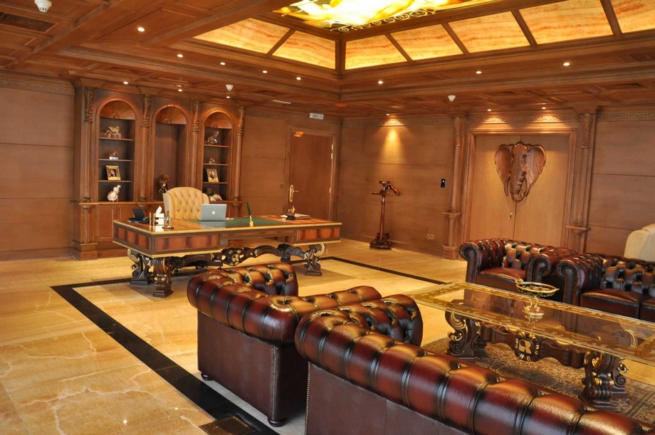
When thinking of ripe tangerines, we associate them with warm, vibrant colors such as red, orange, yellow, and brown. These hues are captivating and alluring, drawing everyone’s attention.
The color of “ripe tangerines” is often used in designs that convey passion and enthusiasm. However, because they are such vivid colors, they are rarely used as the main color for an entire room. Instead, warm tones are typically used as accents to create artistic focal points within the design.
3.2. Warm Tones and Fine Details:
Why are warm colors used as accents in a room’s design? This is because warm colors are bright and bold, and they immediately draw attention. However, when used in the overall design, they may lack the softness necessary for relaxation, which is key in relieving the stress of a busy workday.
Using touches of orange, yellow, or red on accent walls creates a unique and distinct atmosphere. These colors symbolize passion, energy, and the drive to steer the ship toward success, embodying the leader’s determination.
Conclusion:
Colors in the design of the president’s office not only bring artistic beauty to each style but also reflect the leader’s essence and personal taste. To create the perfect president’s office, it’s essential to blend the leader’s preferences with a harmonious combination of colors. This results in a space that is both calming and full of the passionate energy that defines a great leader.
====
PROCE – LUXURY OFFICE SOLUTIONS
Website: https://proce.vn/
YouTube: https://www.youtube.com/channel/UCmHTphVmf6cD9N9nwbb5kvA
Facebook Fanpage: https://www.facebook.com/vanphongnhapkhauProce
Google Business: https://business.google.com/dashboard/l/15115233216900975876
LinkedIn: https://www.linkedin.com/company/74359718/admin/
Hotline: 090.115.6767
#high_class_office_funiture
#high_end_office_funiture
#Chairman_Office_design
#Chairman_Office_interior
#Chairman_Office


