
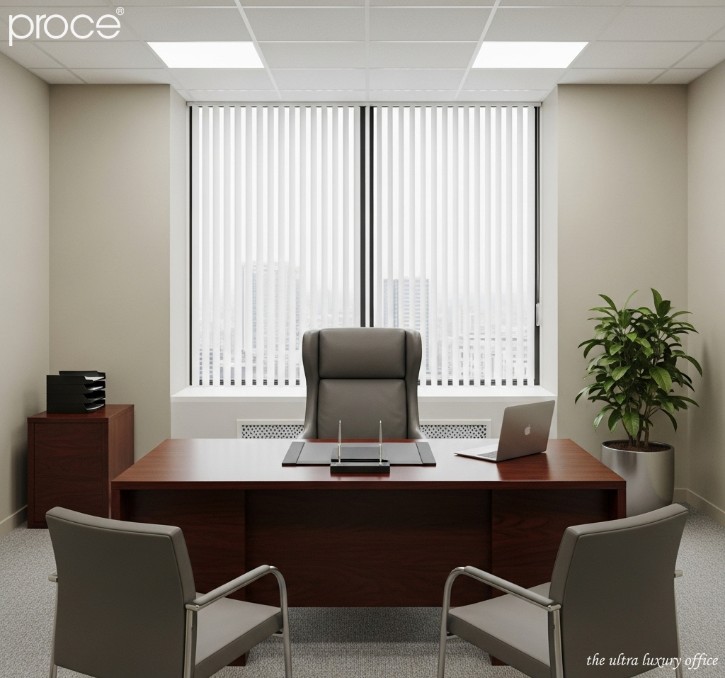
In high-end interior design, the chairman office is not only a place to run the business. It is also a declaration of power, aesthetic taste and strategic vision of the leader. However, many luxurious spaces lose their inherent charisma just because of basic mistakes in the color coordination of floors – ceilings – walls. Although they seem to be the background elements, these three surfaces are the “aesthetic skeleton” that determines the success or failure of the entire design. With more than 10 years of experience in the field of leadership space design. I will analyze the most common mistakes, so you can avoid making the same mistakes. And create a truly classy space.
Common mistakes when coordinating ceiling – wall – floor colors in the chairman office
Mistake #1: Too contrasting colors – Creates tension and lack of uniformity in chairman office
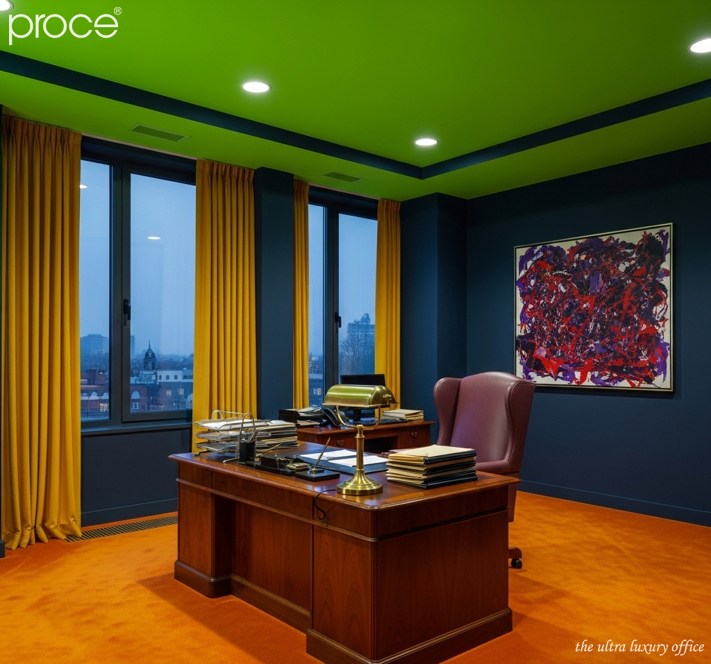
One of the most common mistakes in designing a leadership office space is the color combination that is too contrasting between large surfaces such as the floor, wall and ceiling. A typical example is when choosing a floor that is too dark like black walnut. While the wall is pure white and the ceiling has a neutral cool tone. This “phase difference” makes the space disjointed, lacking visual connection and losing the necessary depth. When the human eye has to constantly adjust to get used to the contrasting color blocks. It will easily cause a feeling of tension and difficulty concentrating. This is completely unsuitable for a space that requires high concentration and shows power like the leadership room.
To overcome this, it is necessary to build a soft transition color system between the layers of space. It is possible to apply advanced monochrome color schemes. That is, using many levels of light and dark of the same main color to create a smooth, luxurious transition. In addition, choosing similar colors in the same color system will help create a more harmonious, comfortable feeling while still being classy. (How much is a reasonable investment for the president’s office?).
Mistake 2: The ceiling is too dark – losing the feeling of height and luxury in chairman office
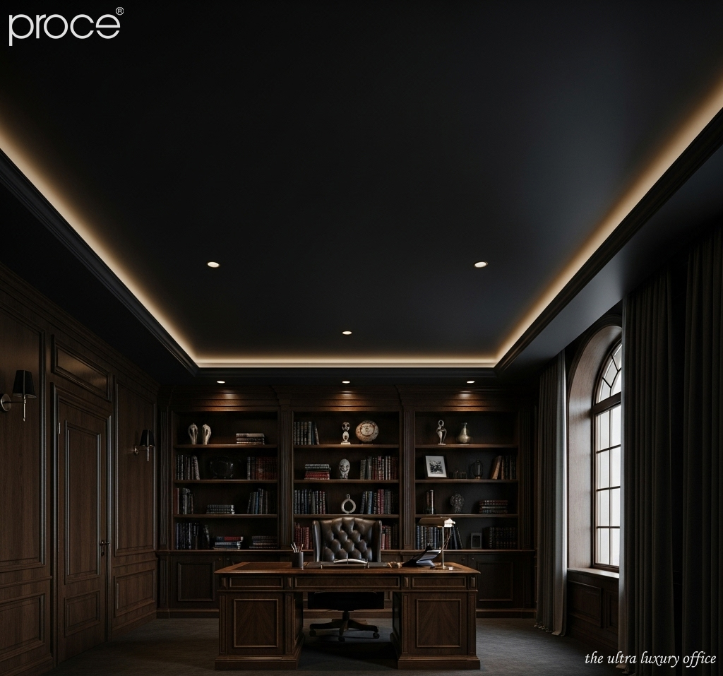
A common mistake in designing a leader’s office is choosing a ceiling with a color that is too dark. It comes from the desire to create a warm or personal feeling for the space. Many people accidentally use inappropriate paint colors or materials. This results in a visually narrowed space. Dark ceilings make users feel oppressed and lack ventilation. This is especially not recommended in the president’s office. This place requires spaciousness, clear vision and an open mind.
In principle, the ceiling should be the “lightest” surface in the three foundations of the space: floor – wall – ceiling. Choosing a ceiling that is at least one tone lighter than the wall will help “push the ceiling” higher. It creates a feeling of height and airiness. Colors such as warm white, light cream or light beige are always safe choices but no less sophisticated and modern.
Unless you have a dedicated lighting system and a ceiling design with enough technical depth to balance the dark color, always prioritize a bright ceiling. This is an important factor that helps affirm the class of the space. At the same time, it contributes to demonstrating the prestige, position and stature of the head of the business.
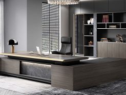
Mistake 3: The floor is too prominent – taking up the “spotlight” of the entire space
Many presidents’ offices often make the mistake of choosing a floor color that is too prominent. With the desire to create a unique highlight for the space. However, when choosing a wooden floor with strong grain, too bright colors such as dark red or dark orange. The effect is often counterproductive. Instead of honoring the interior and overall architecture. The floor “takes over” completely, causing visual interference and diluting the main point of view.
The floor should act as a solid foundation to support the entire design. Neutral tones such as light brown, light gray or warm gray with light grain… will create elegance and luxury without being confusing. If you still want to create your own personality, you can choose a floor with a slight contrast to the wall. As long as they are in the same color palette or temperature system (warm/cool). The important thing is that the floor does not “overwhelm” the central elements. But must support them to shine in the right position, for the right purpose with the original design. (5 ideas for president’s office design inspired by nature).
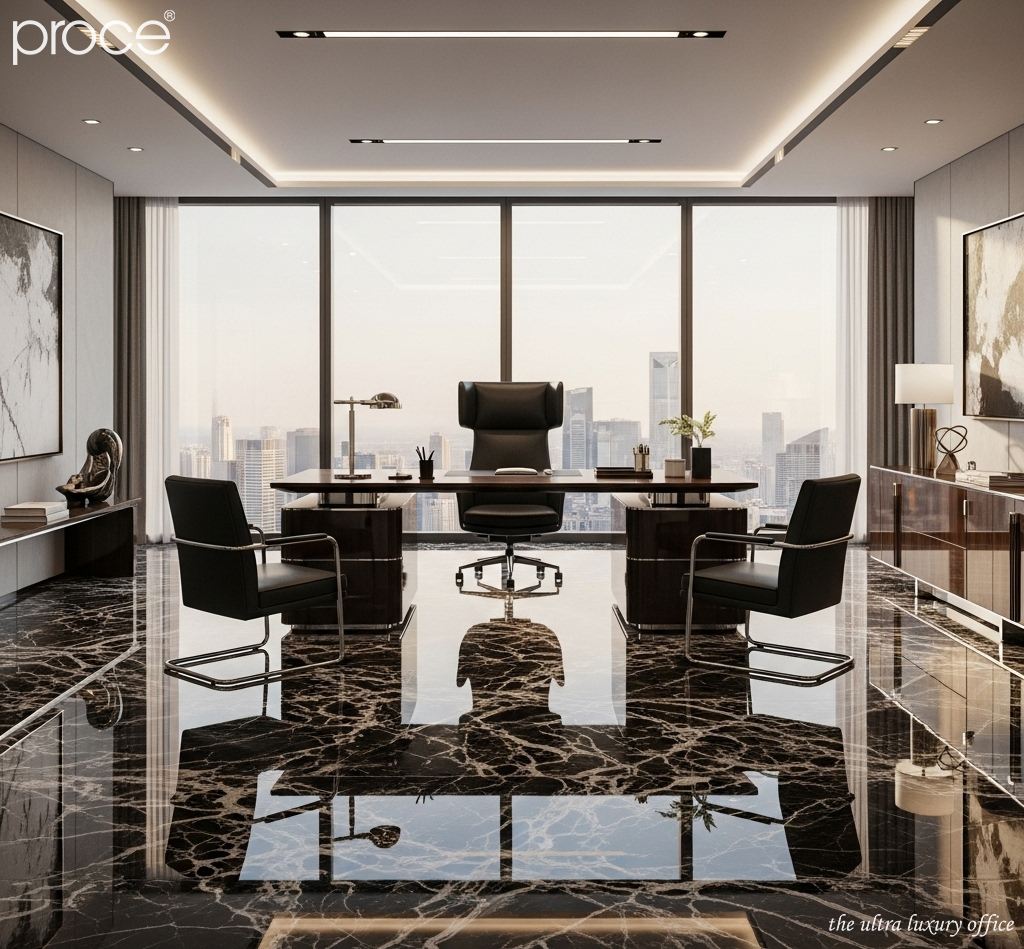
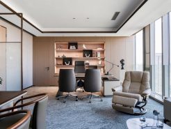
Mistake 4: Lack of color connection between floor – ceiling – wall
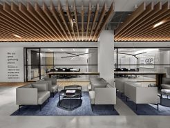
When the ceiling, walls and floors act as three separate entities, without a common language. The space will become confusing and unprofessional. For example, an office with a cold gray floor, warm beige walls and a white ceiling. It is easy to create a sense of dissonance, losing visual unity. This is a “silent” mistake but extremely affects the first impression. Especially with VIP guests or important partners when entering the leader’s workspace.
The solution lies in establishing a connected color scheme. Use the 60–30–10 rule. 60% for the dominant color (usually the walls), 30% for the secondary color (like the floor). And 10% for the accent color (can be the ceiling, decor, or furniture). Also, keeping the tones in the same temperature range – all warm or all cool – will help create visual continuity. You should also take advantage of the natural beauty of materials. Like wood, stone, or metal to connect the planes together, without overdoing paint or artificial colors.
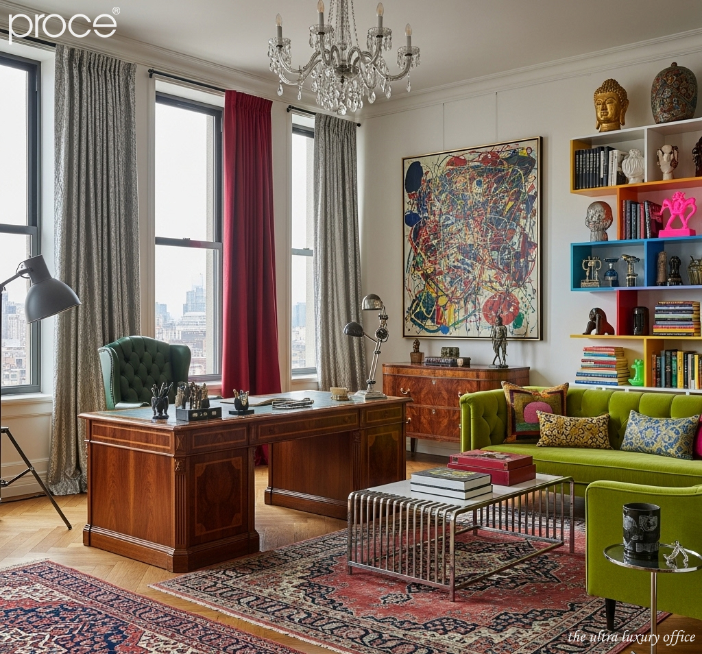
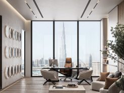
Mistake #5: Too safe, bland color scheme – no personal touch
A leadership space not only needs to be luxurious. It also needs to express the personality, thinking and identity of the leader. However, many designs make the mistake of choosing too safe colors such as white – beige – light gray for the entire space. This leads to a “monochromatic” effect, without highlights, leaving no deep impression on the user. This is a seemingly small mistake, but it makes the office lose the ability to “tell a story” about its owner.
The leadership space should be a place to express a positive self. The leadership spirit and the brand story. Don’t be afraid to use a personal color, maybe a color that has been associated with the development journey. Or a color that represents the company’s values. To include details such as an accent wall, leather chairs or decorative paintings. An accent wall with a unique color, combined with a neutral floor and a bright ceiling. Can create a solid foundation for the entire space. At the same time, convey the spirit of personalization clearly and subtly. (Techniques for hiding electrical wires in interior design of the president’s office).
Conclude
The president’s office does not need to be too ostentatious. But it absolutely must not be superficial, especially in the background elements such as the floor, walls and ceiling. Incorrect color coordination not only affects aesthetics. It also directly affects emotions, thinking and how others perceive the leadership position. Seemingly small mistakes are the things that silently drag down the class of the space. As a designer, I believe that sophistication lies in the details that others easily overlook. And when you do it right from the core foundation. Everything above, from the interior to the temperament, will naturally rise to another level.
=====\
PROCE – TOTAL LUXURY OFFICE SOLUTION
Website: https://proce.vn/
Youtube: https://www.youtube.com/@noithatvanphonghangsang
Fanpage: https://www.facebook.com/vanphongnhapkhauProce
GG Business: https://business.google.com/dashboard/l/15115233216900975876
Linkedin: https://www.linkedin.com/company/74359718/admin/
Hotline: 090.115.6767
#phong_lam_viec_chu_tich; #phong_chu_tịch; #thiet_ke_phong_lam_viec_chu_tich
#noi_that_phong_lam_viec_chu_tich; #thiet_ke_noi_that_phong_lam_viec_chu_tich
#phong_lam_viec_chu_tich_chuan_sang; #phong_lam_viec_chu_tich_dang_cap